Brand Concept
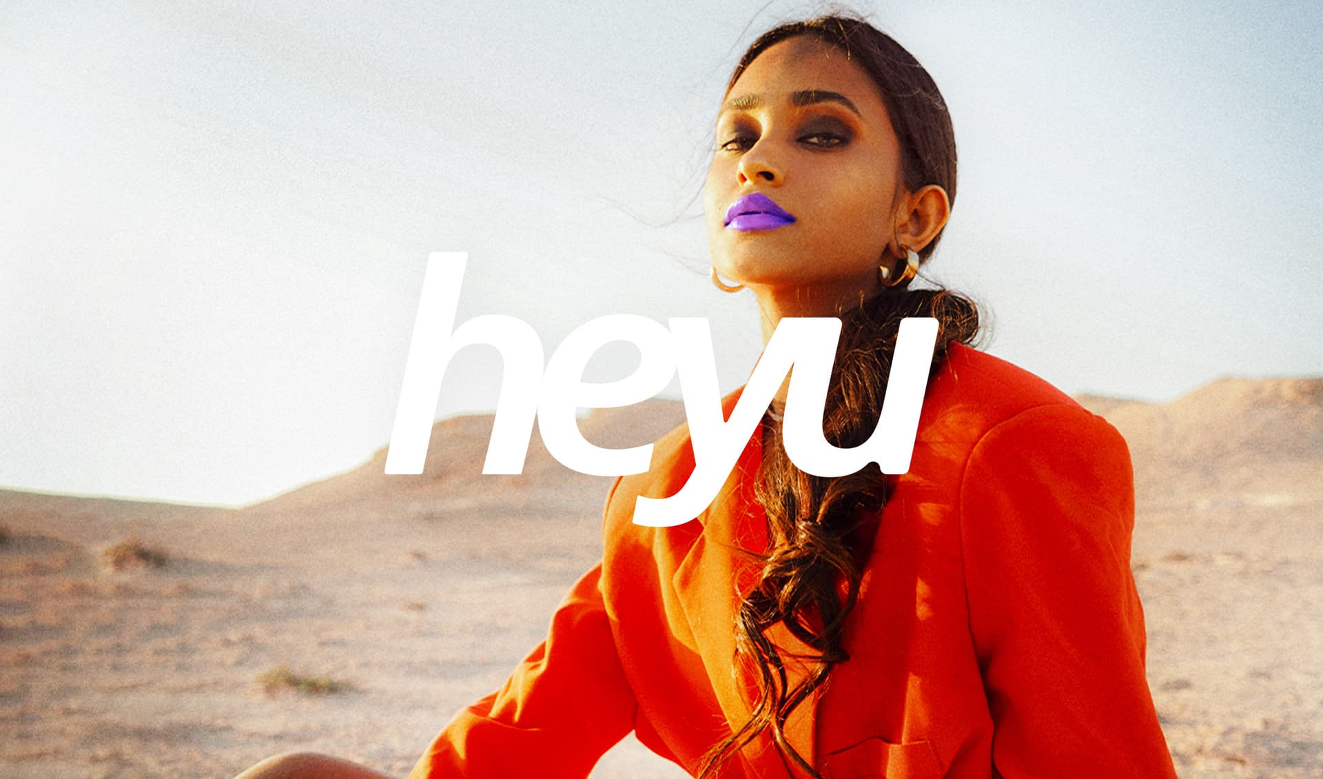
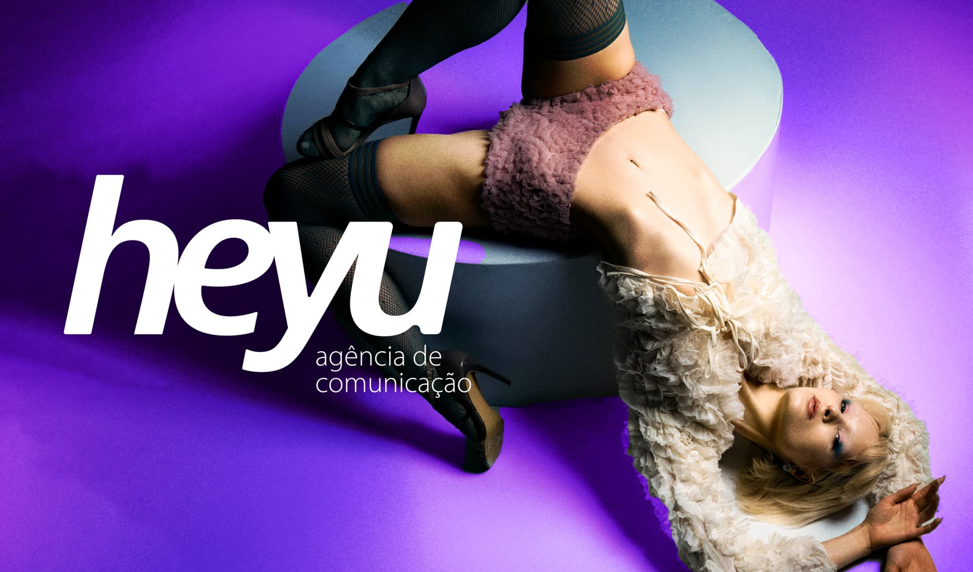
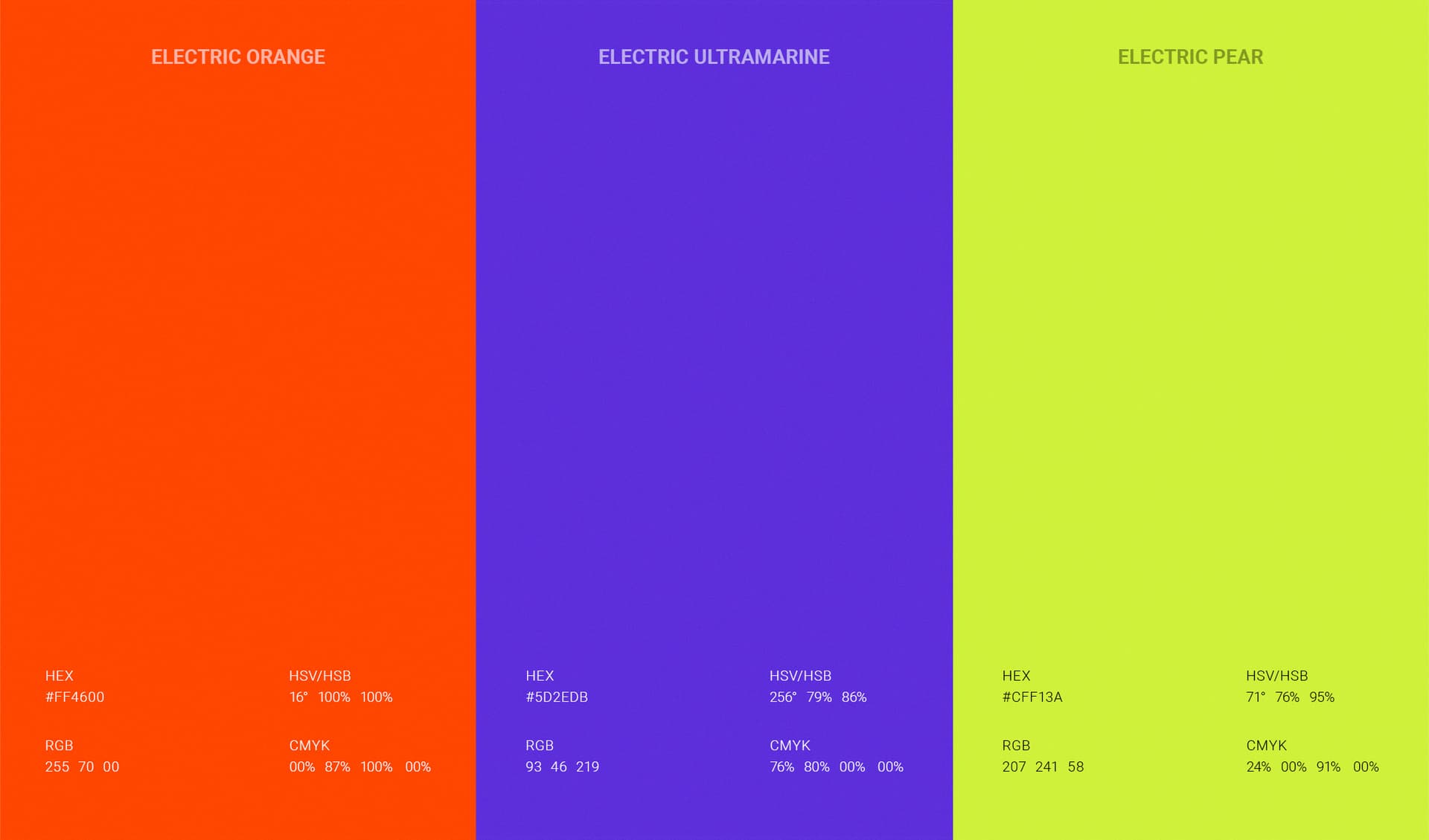
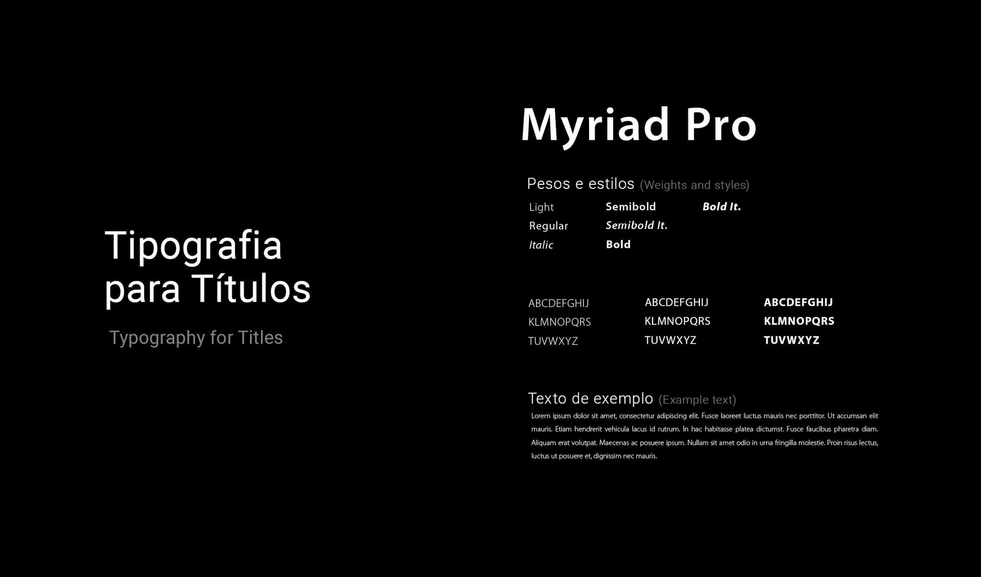
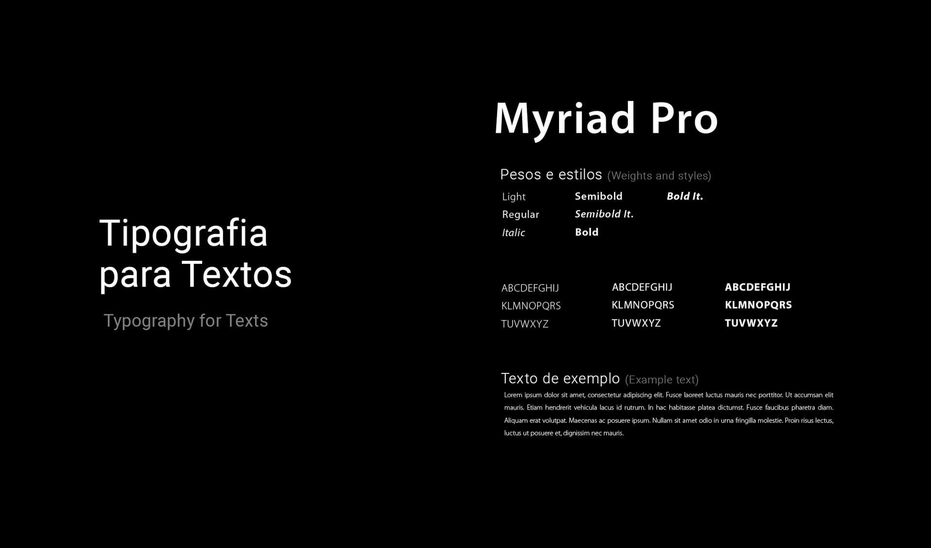
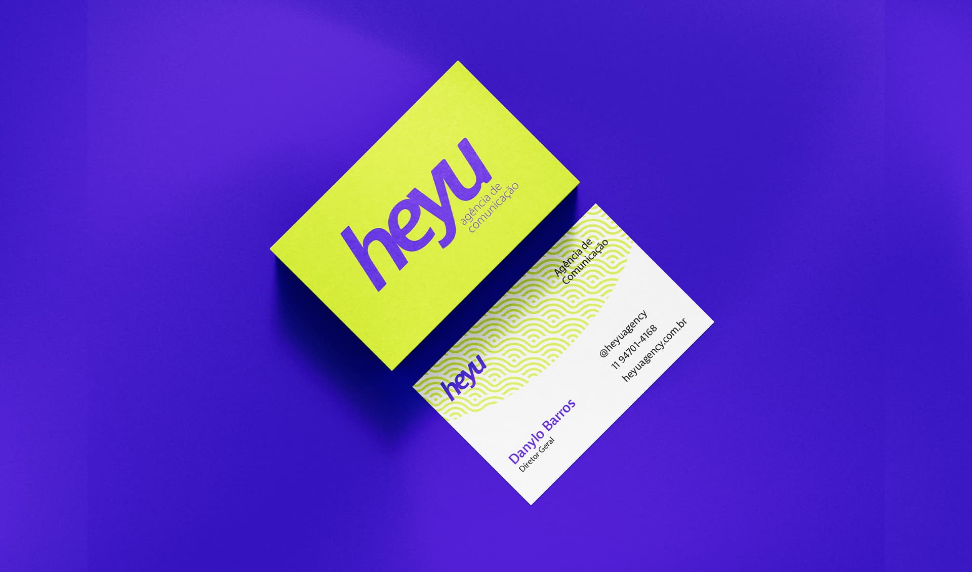
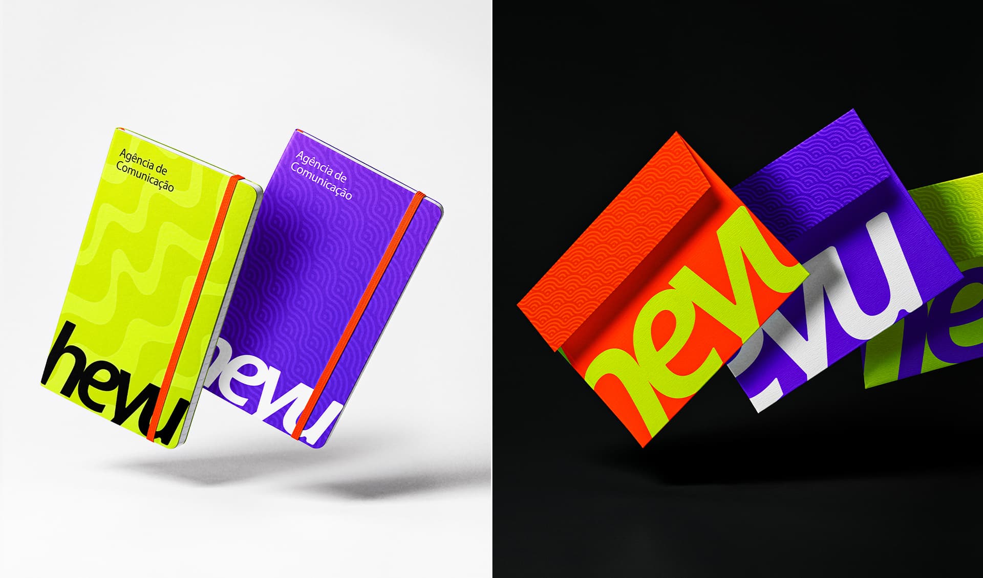
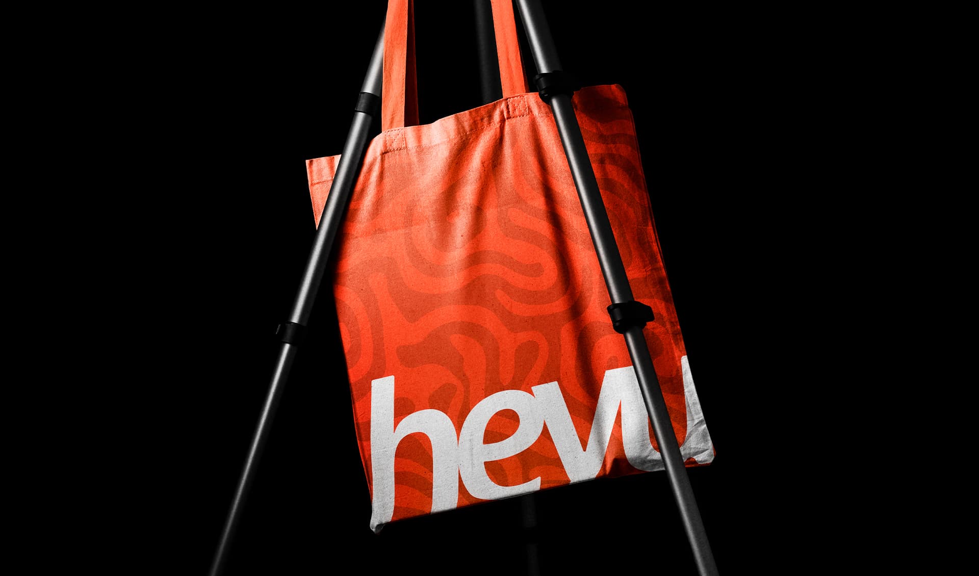
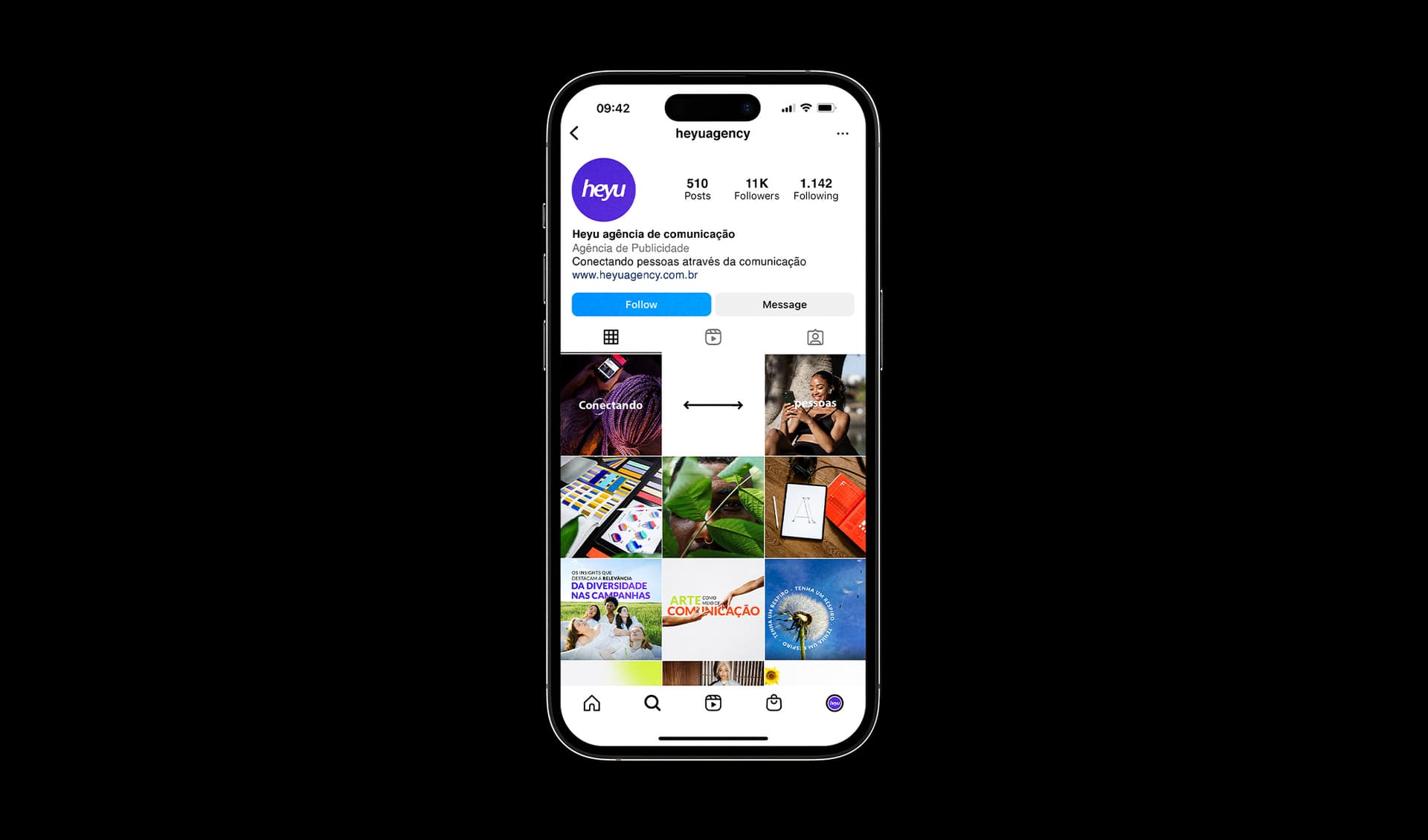
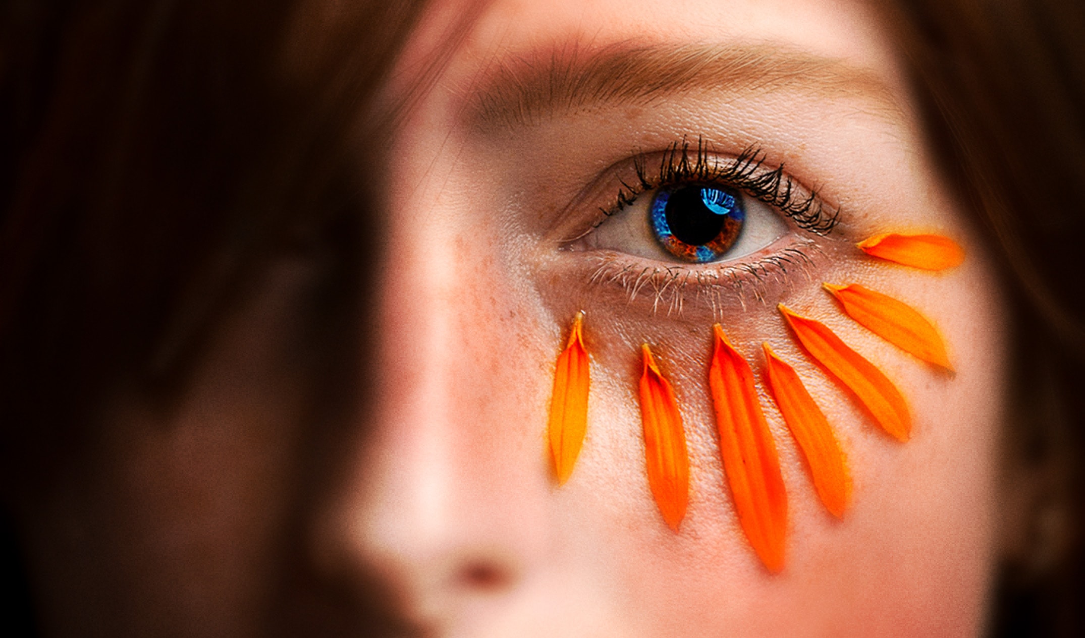
For the visual identity of Heyu Communication Agency, we crafted a unique, custom typography that perfectly encapsulates its dynamic and wildly creative essence. Heavily inspired by the fluid movement of speech and the expressive nature of onomatopoeias found in comics and anime, the logo's design conveys a highly organic and vibrant feel. The softened edges and seamlessly connected letters introduce a sense of continuous fluidity and unbridled dynamism. This typographic approach visually translates the highly efficient and engaging communication that Heyu establishes between bold brands and their diverse audiences. It reinforces the agency's core mission: "Creating authentic connections between brands and people.". The campaign's art direction dives deep into the high-end world of social media and fashion. The striking editorial photography — featuring bold aesthetic choices like vibrant purple lipstick against an arid desert backdrop and edgy, texture-rich poses against vivid purple canvases — elevates the brand's visual narrative. These images, alongside close-up portraiture accented with bright orange flower petals, project an aura of fearless innovation, professionalism, and deep human connection. The use of wavy, dynamic patterns across physical touchpoints like business cards, notebooks, and tote bags further amplifies this sense of continuous, pulsating energy. The chosen color palette is intentionally bold and vibrant, selected specifically for its intense visual impact and profound meaning. Electric Ultramarine (purple) acts as the foundation of creativity and sophisticated depth. Electric Pear (neon green) injects a heavy dose of modernity and high-voltage energy. Finally, Electric Orange serves as the pulse of the brand, symbolizing unyielding enthusiasm, warmth, and active communication. Together, supported by the clean and versatile Myriad Pro typography for all texts and titles, these colors forge a vibrant, contemporary identity that commands attention in any space.