
Brand Concept
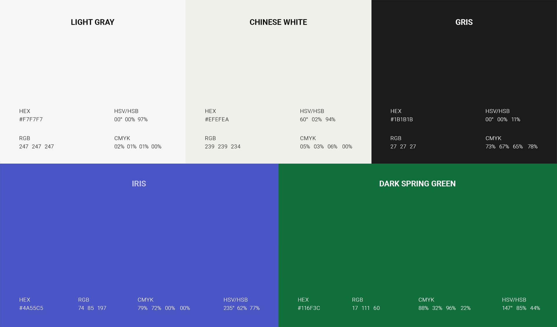
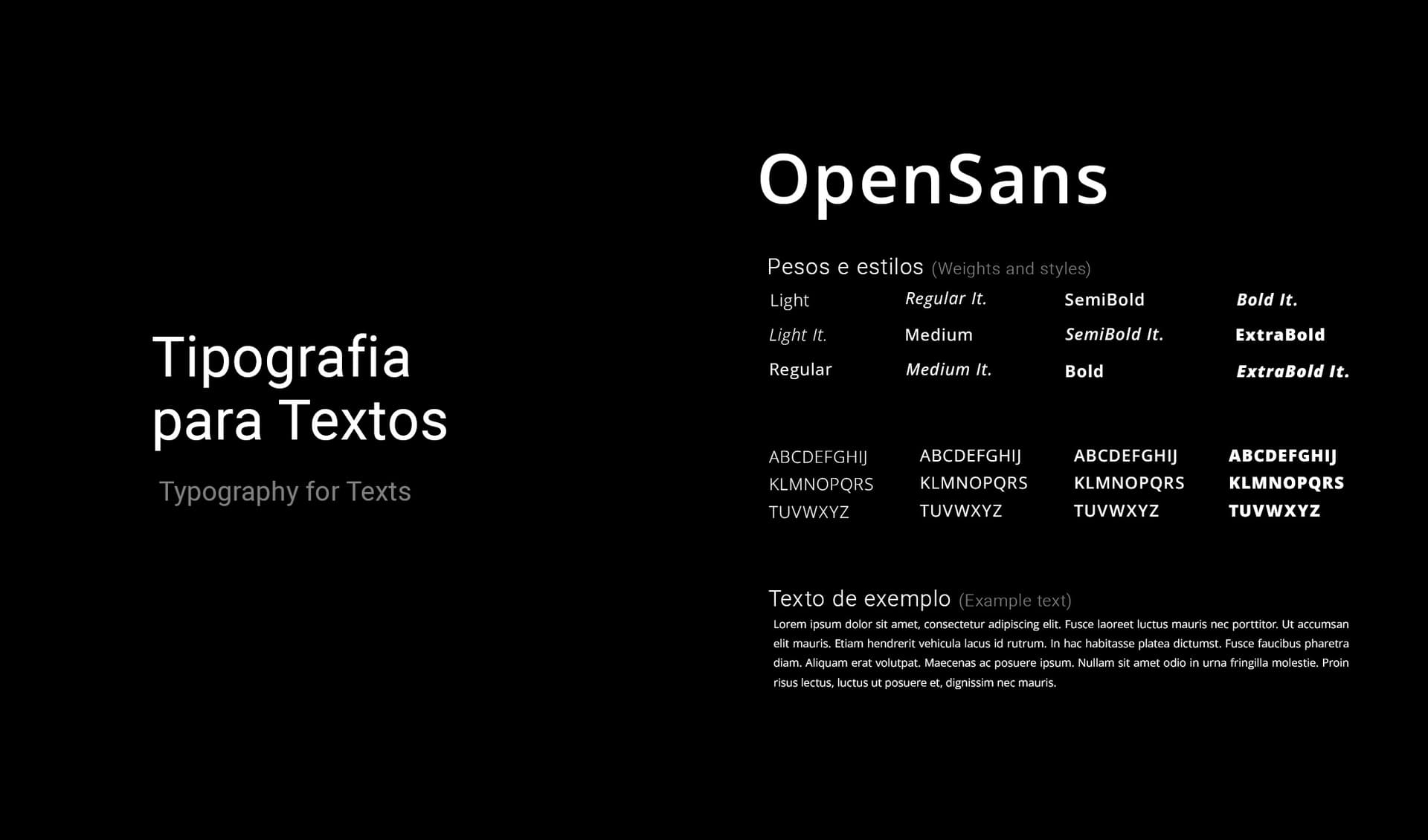
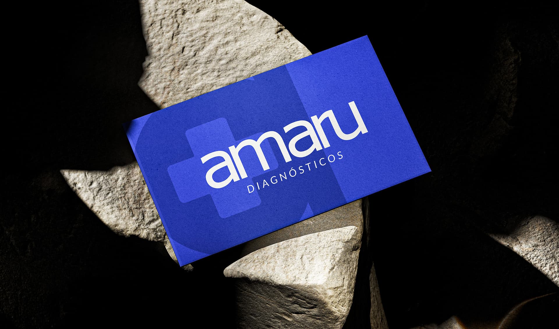
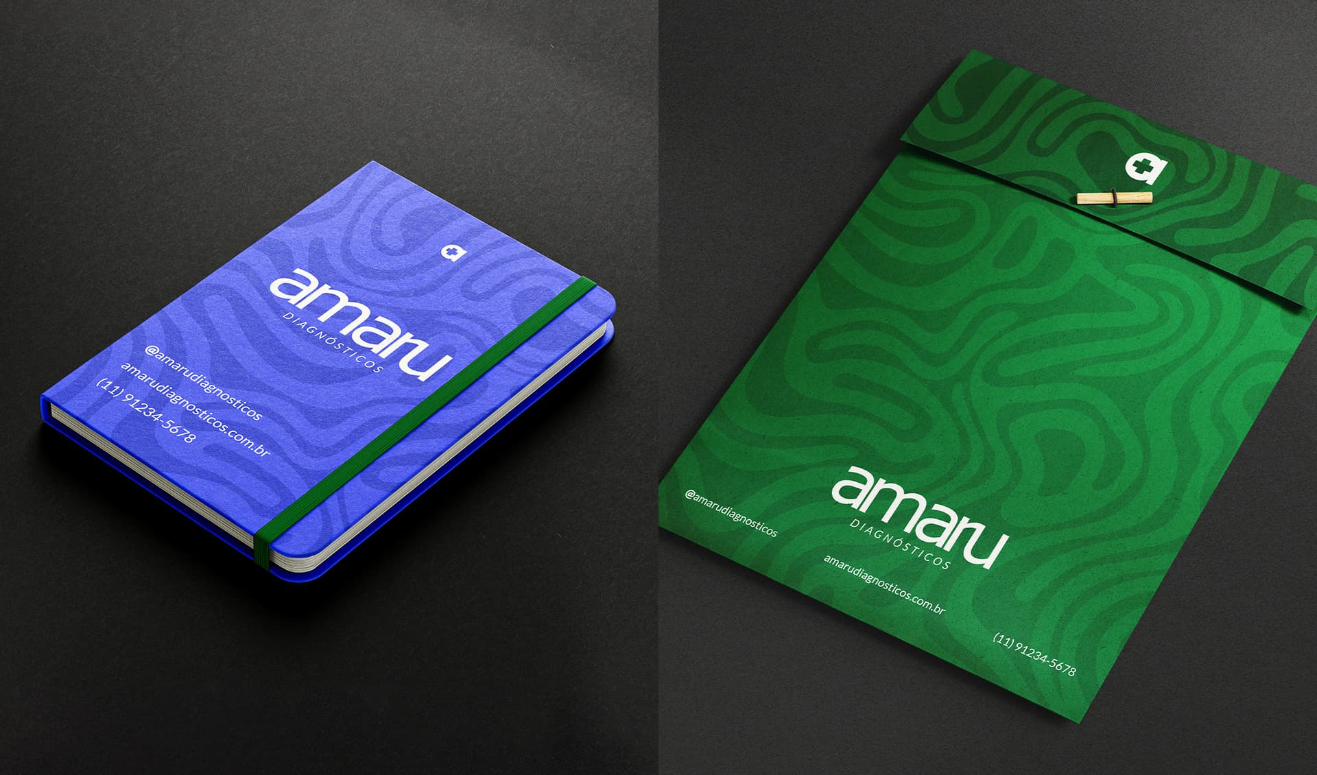
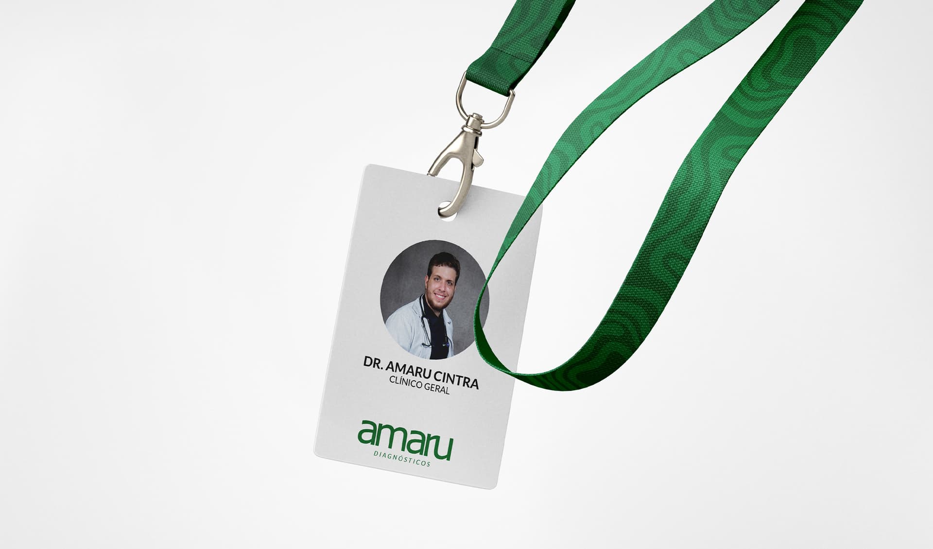
Dr. Amaru is a recently graduated General Practitioner in Paraguay who seeks to establish a professional space dedicated to sharing medical knowledge, clinical practices, research, and the realities of his daily work and study routine. The project was conceived as a platform for communication, learning, and discussion, bringing together professional experiences, clinical cases, and relevant topics from the medical field. The visual identity for Amaru Diagnósticos was developed to translate these values into a clear and approachable visual language. The symbol integrates the “a” from the Amaru name with the universally recognized medical cross, creating a direct connection between the brand and the healthcare field while maintaining a distinctive and contemporary character. The typography complements this concept through a clean and professional structure, reinforcing modernity, stability, and objectivity across the brand's communications. The selected color palette combines green, blue, and neutral tones to create a balanced and trustworthy visual system. Green represents health, growth, and vitality, while blue evokes confidence, tranquility, and security. Together, these elements establish a cohesive identity that reflects Amaru's commitment to medical knowledge and professional development, creating a presence that feels both credible and accessible.