
Brand Concept
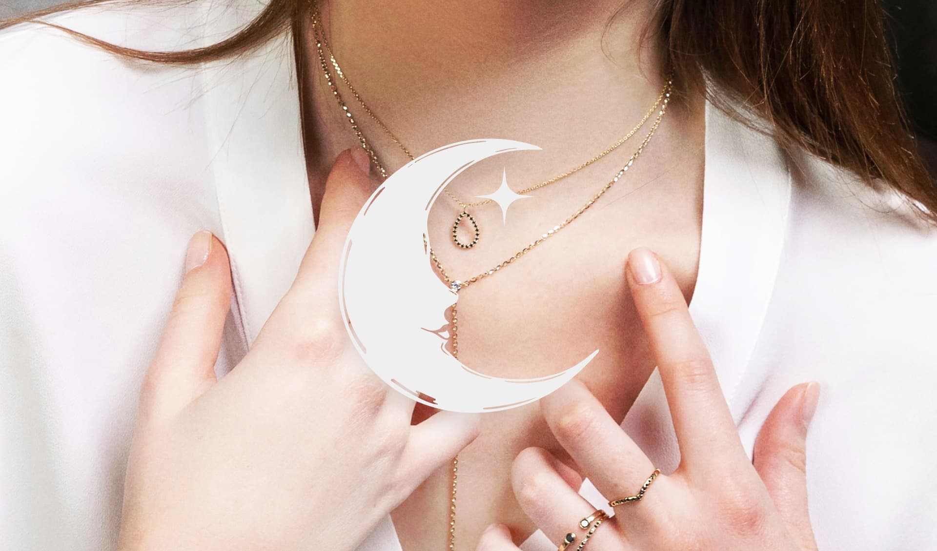
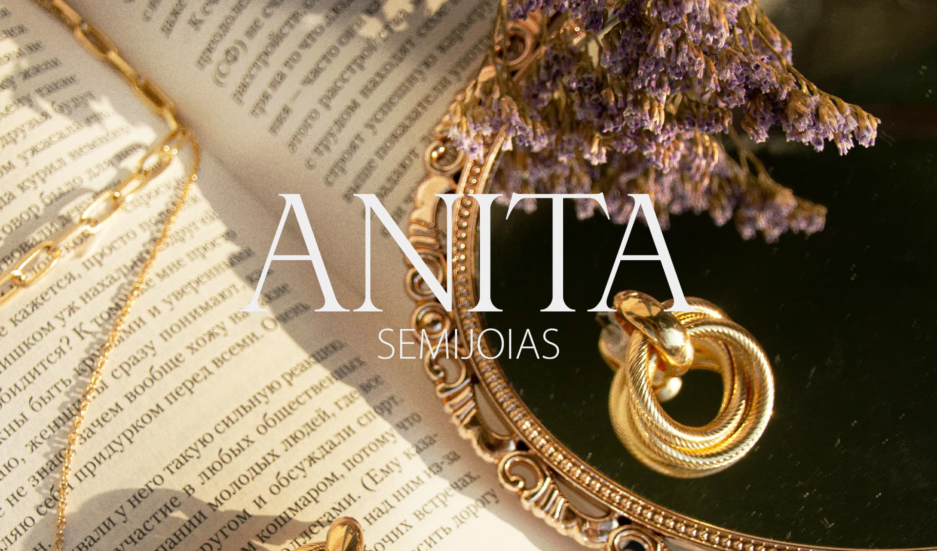
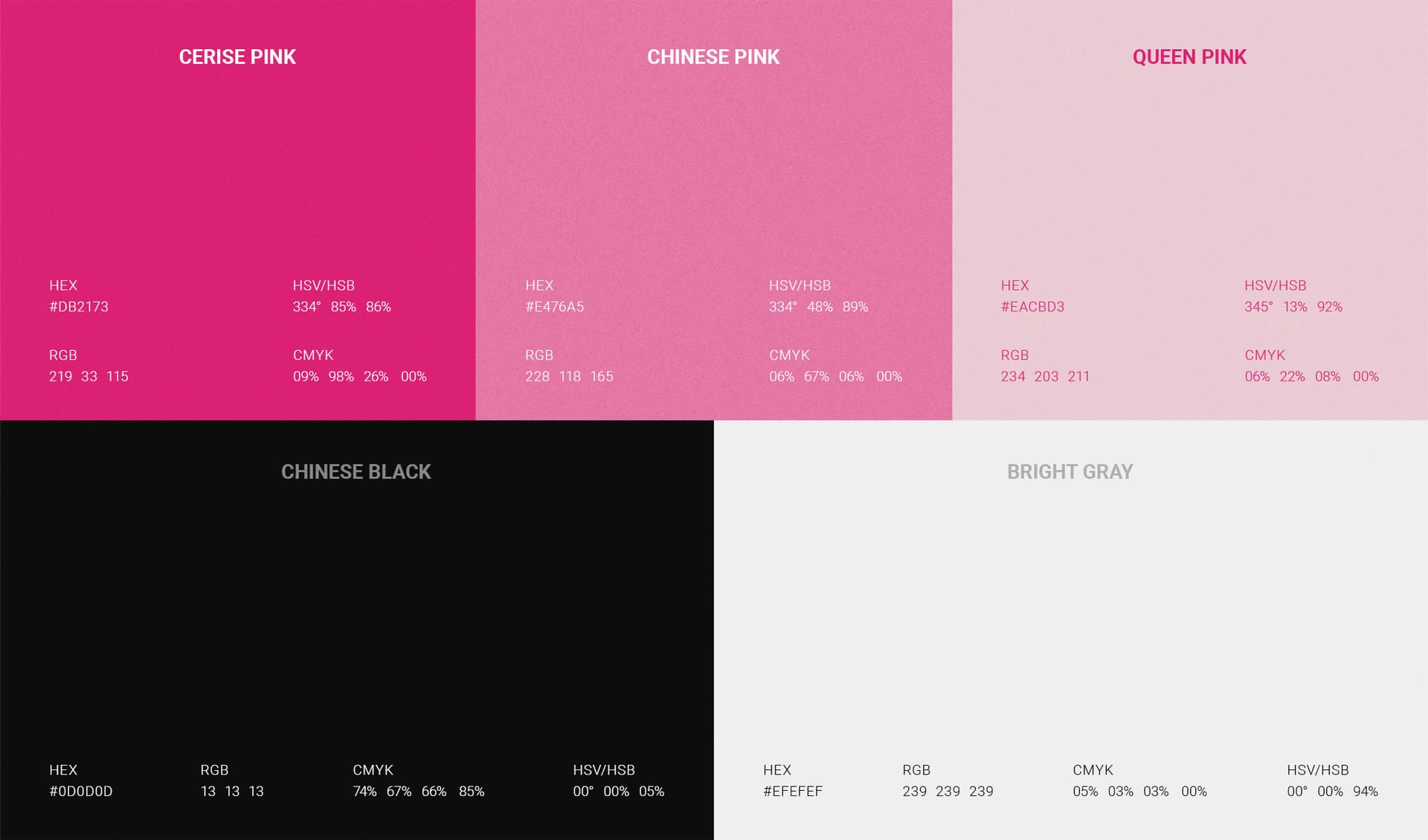
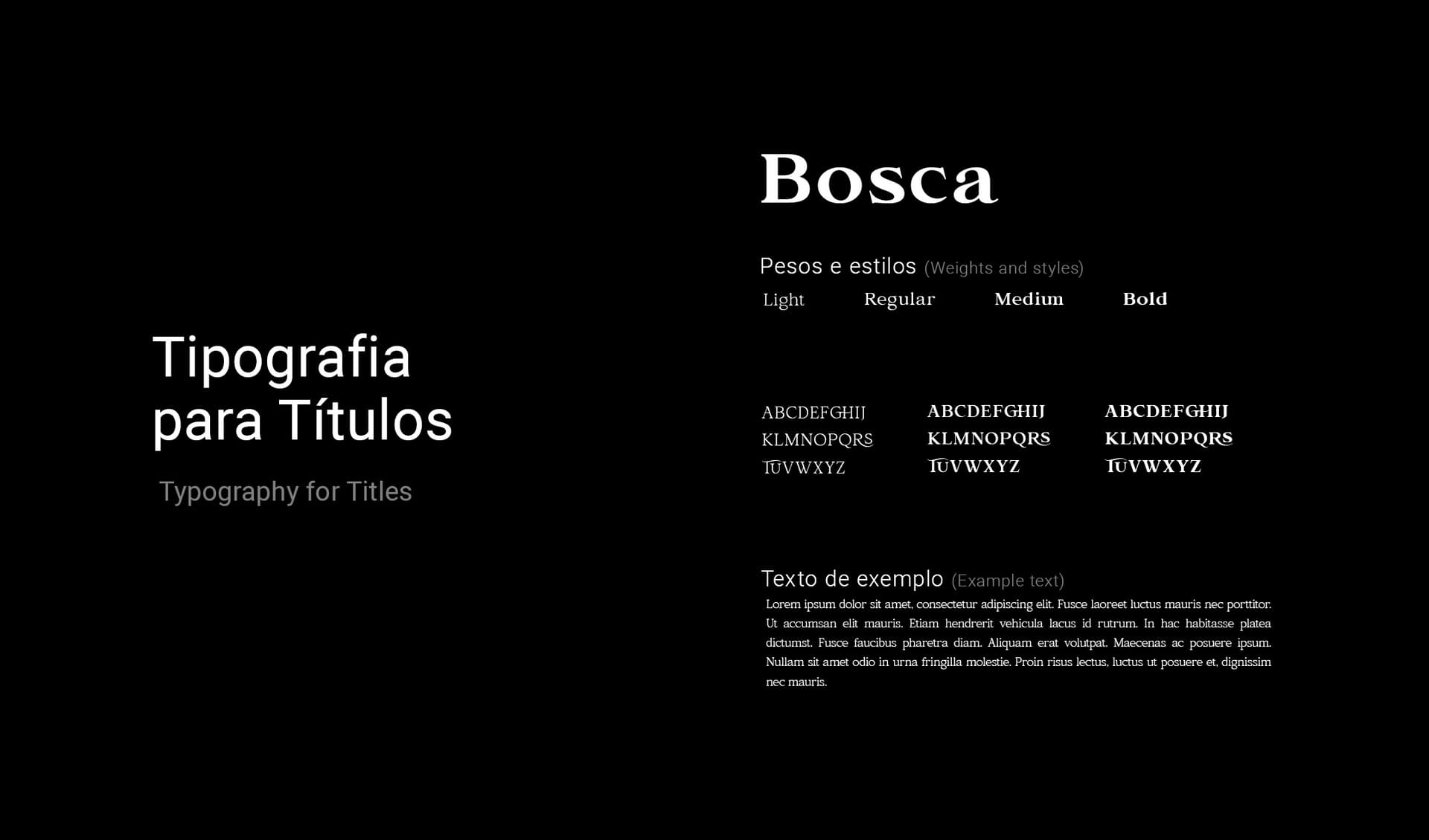
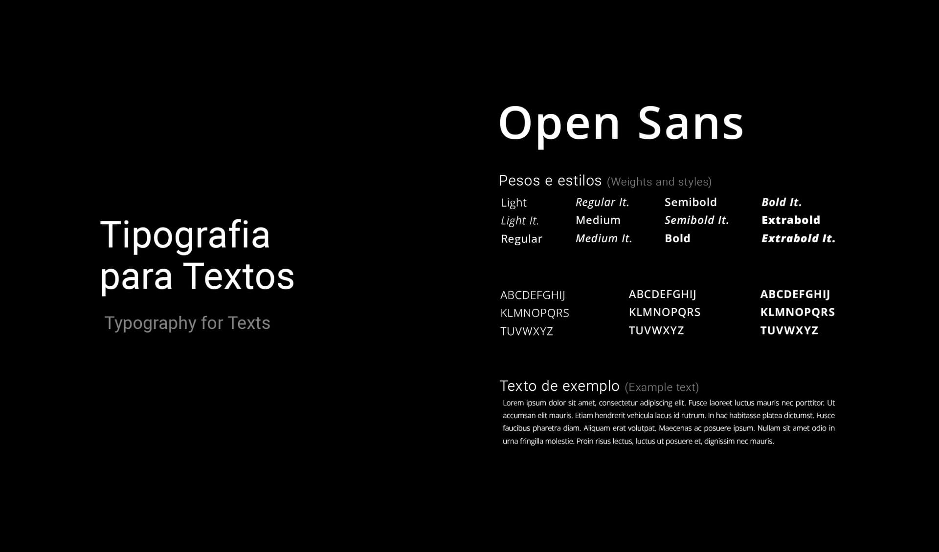
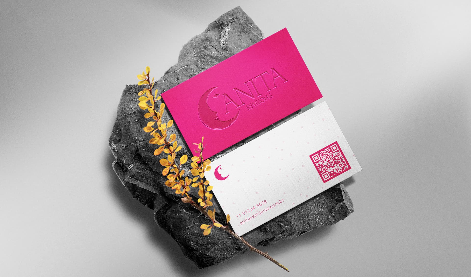
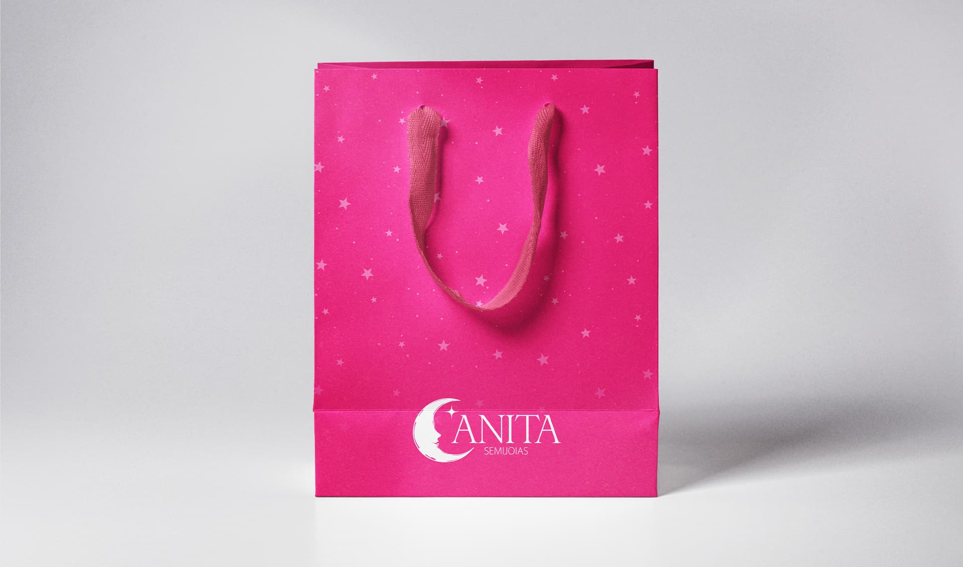
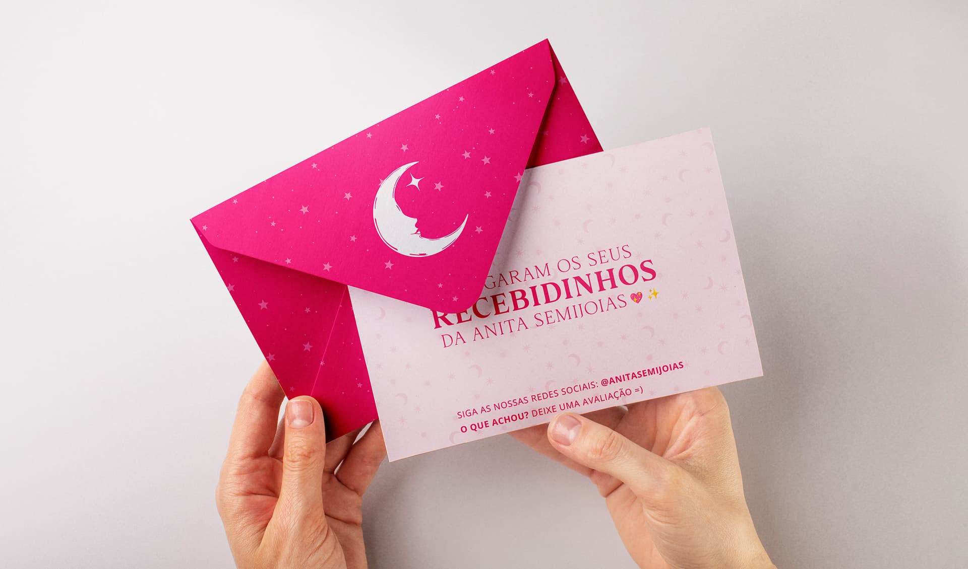
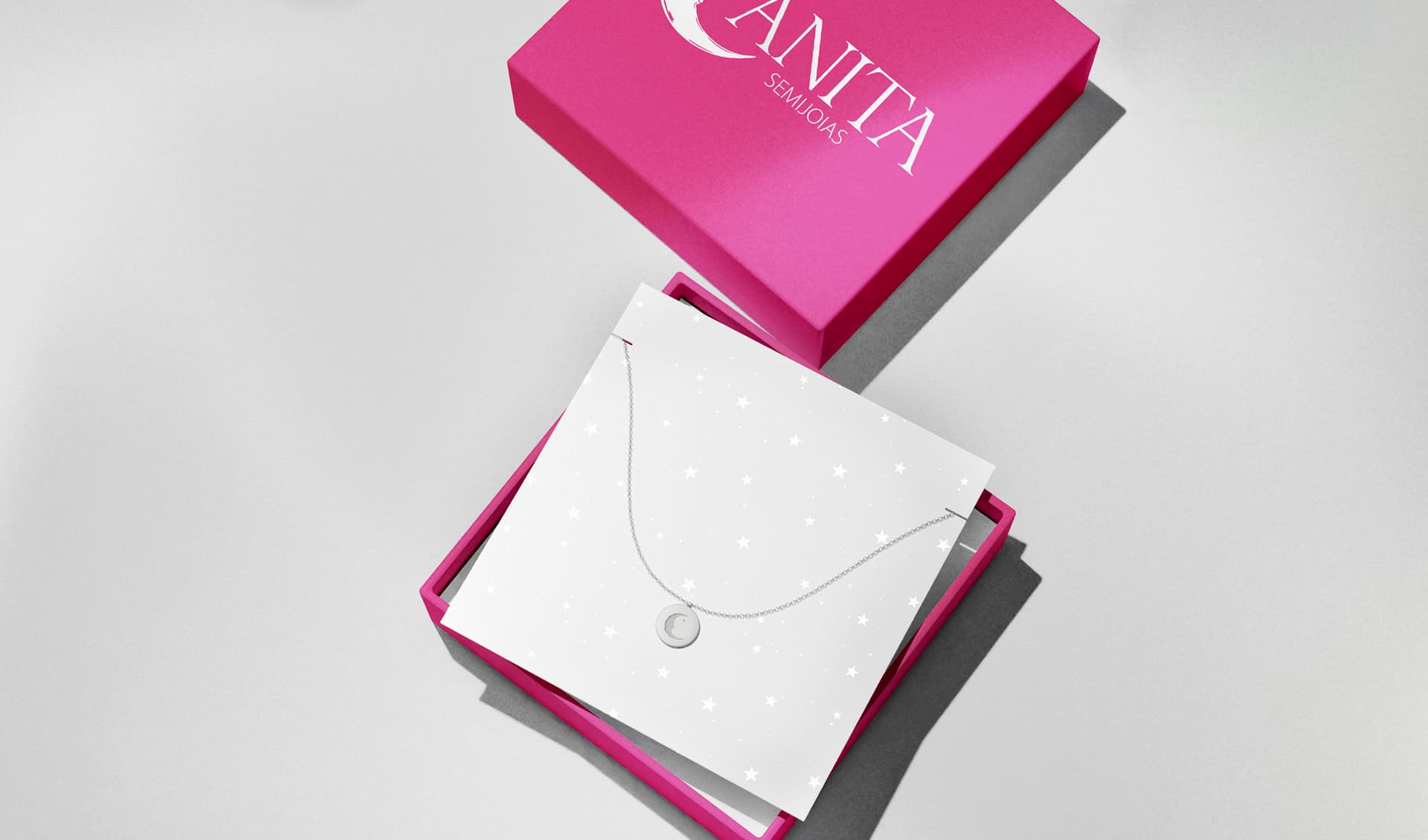
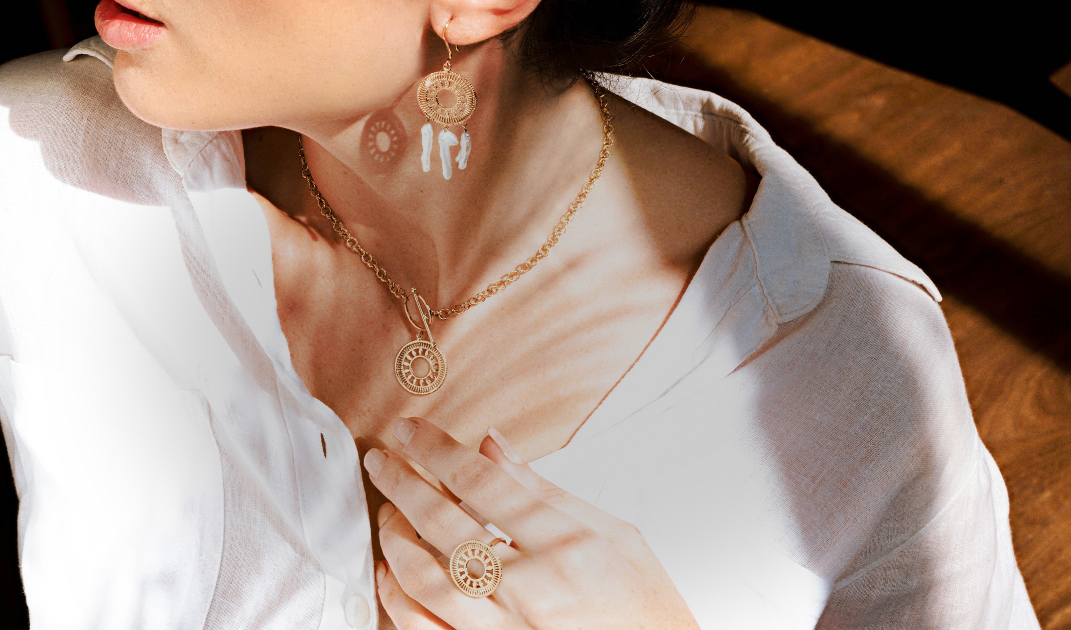
For the creation of Anita Semijoias' visual identity, we developed an elegant and sophisticated typography, accompanied by an icon symbolizing the moon. Featuring the delicate silhouette of a feminine face resting within its crescent, the symbol acts as a powerful representation of femininity, intuition, and continuous transformation. This design conveys lightness, delicacy, and strength, reinforcing the brand's identity in an authentic and cohesive way. The campaign's art direction and photography translate this concept into a sensory experience by capturing warm sunlight resting naturally on the skin, highlighting the jewelry intimately. Surrounding elements like vintage mirrors, open books, and dried flowers add a profound layer of everyday romanticism to the visual narrative. This approach visually echoes the brand's core promise shown in the campaign: "jewelry that reflects your essence.". The color palette was carefully selected to express different, multidimensional nuances of femininity. Deeper, vibrant shades, like Cerise Pink, add a bold touch of modernity, energy, and sophistication. Meanwhile, soft pink tones, such as Chinese Pink and Queen Pink, evoke gentleness, romance, and delicate grace. The strict balance between Chinese Black and Bright Gray ensures versatility and high-end refinement, resulting in a harmonious and captivating aesthetic. Anita Semijoias is more than just a brand - it is the embodiment of dreams transformed into accessories that carry meaning, beauty, and timelessness. Each piece reflects the essence of those who wear it, turning fleeting moments into beautifully cherished memories.