Brand Concept
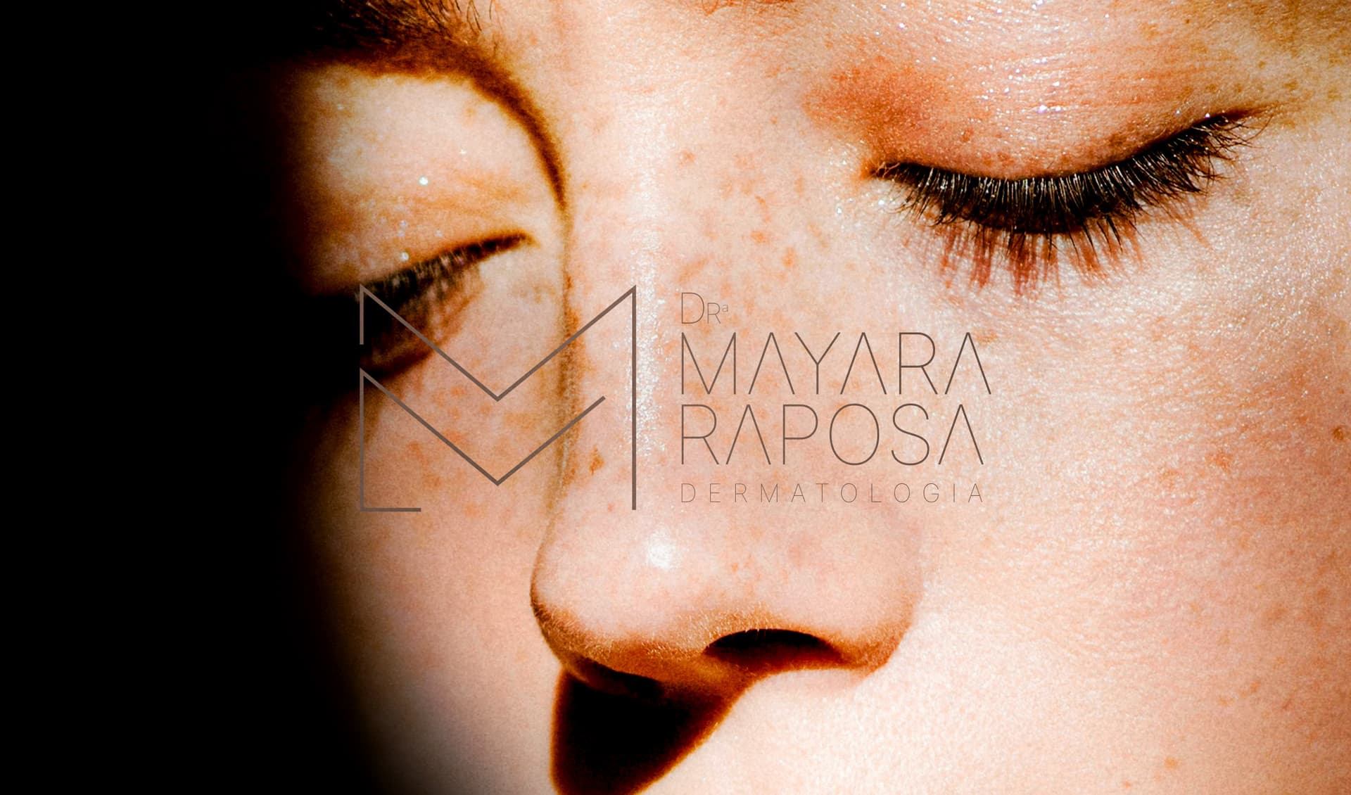
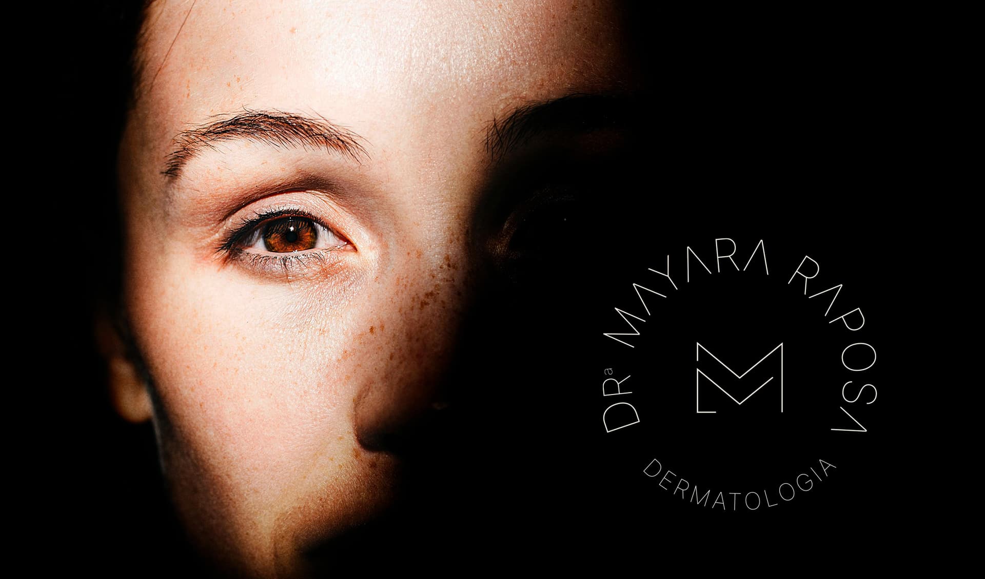
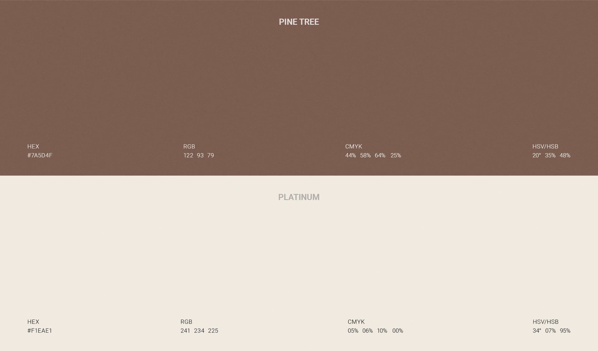
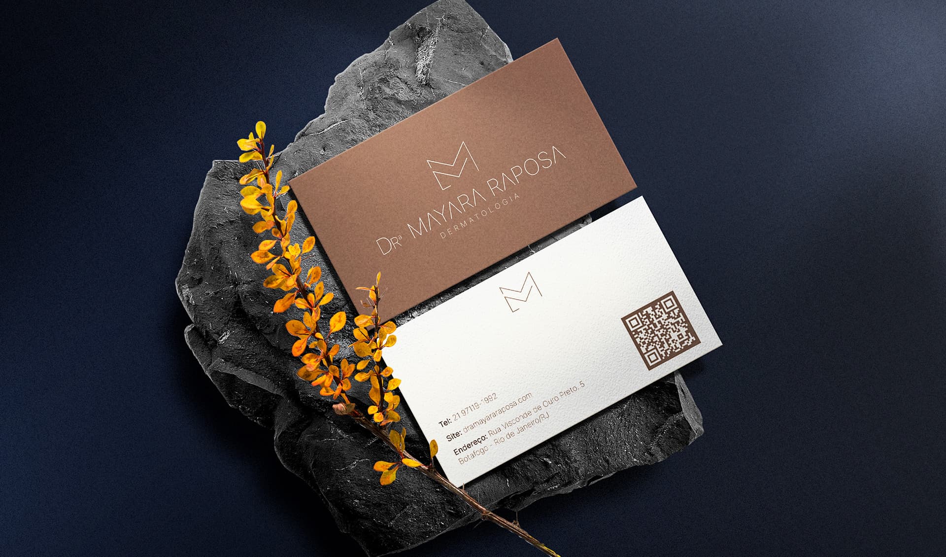
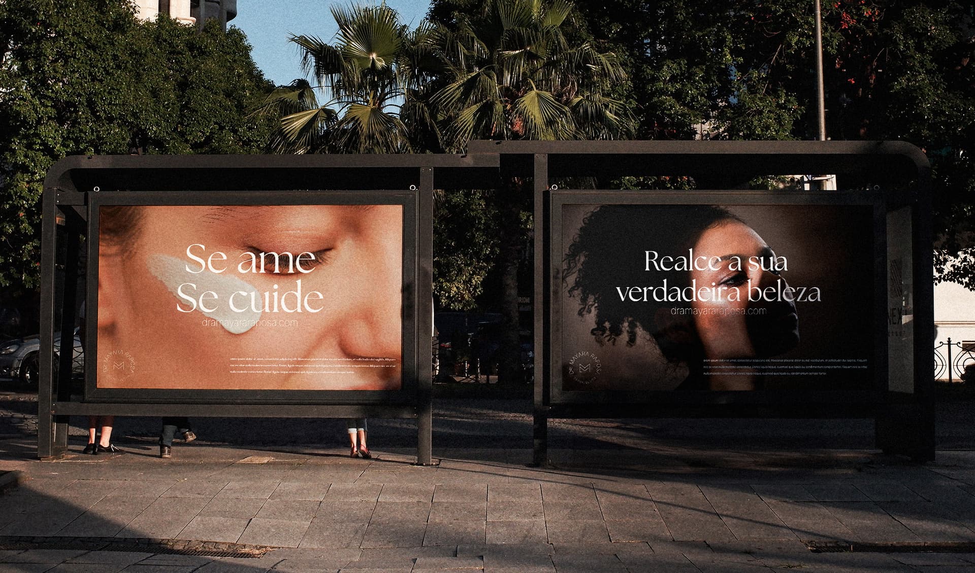
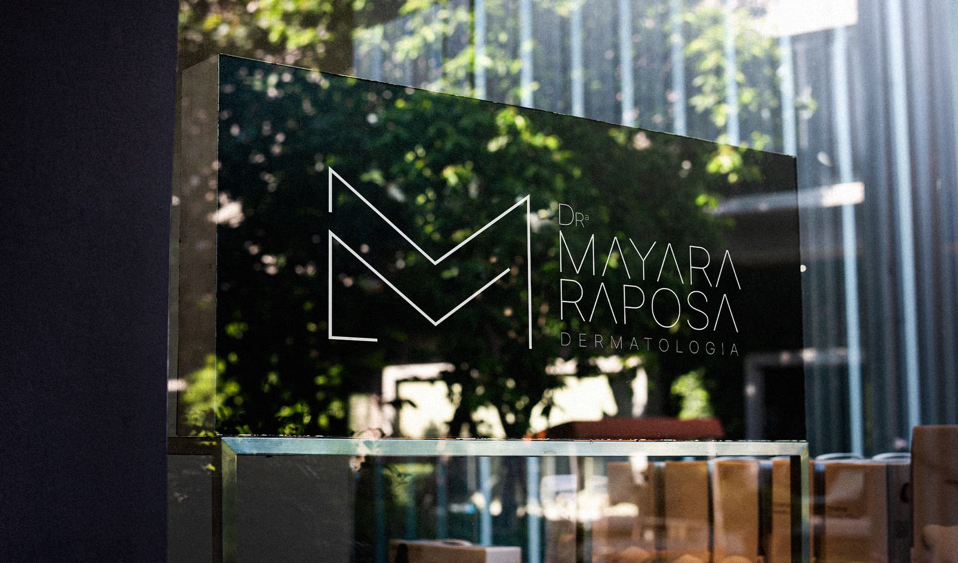
For the creation of Dr. Mayara Raposo – Dermatology's visual identity, we developed a symbol that subtly and elegantly combines typography with an organic concept. The fusion of the initials M and R with the minimalist silhouette of a fox results in a unique and distinctive brand icon. To achieve this design, the letter R was tilted to form one of the ears and the snout, while the letter M was trimmed and shaped to create the other ear and the rest of the fox's face. This seamless integration reflects the precision of dermatological medicine, where every detail is meticulously planned to reveal natural harmony. The macro photography featured alongside the identity — focusing on real skin, its freckles, pores, and natural textures under soft sunlight — establishes a direct dialogue with the brand's core purpose. The skin is not treated as a generic or artificially perfected surface, but as a living, breathing, and uniquely human canvas. The fox, as a creature of nature, reinforces this connection to organic beauty, intelligence, and intuitive, nature-inspired self-care. The chosen color palette — off-white and brown — deliberately moves away from the cold, clinical atmosphere of traditional medicine. Off-white represents purity, softness, sophistication, and the gentle touch of premium treatments. Meanwhile, brown symbolizes the earth, stability, reliability, and the rich diversity of skin tones and melanin. Together, these elements establish a harmonious and cohesive visual identity that perfectly reflects Dr. Mayara Raposo's expertise and unwavering commitment to providing dermatological care with excellence, scientific precision, and deep, humanized attention.