
Brand Concept
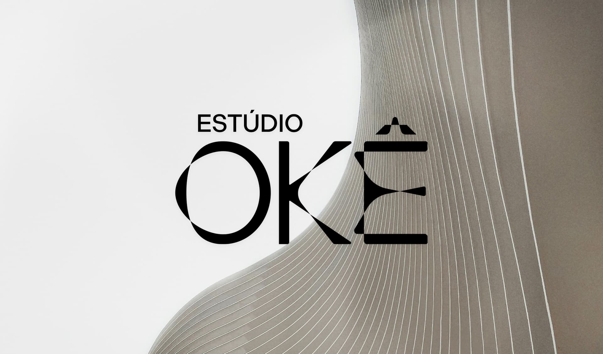
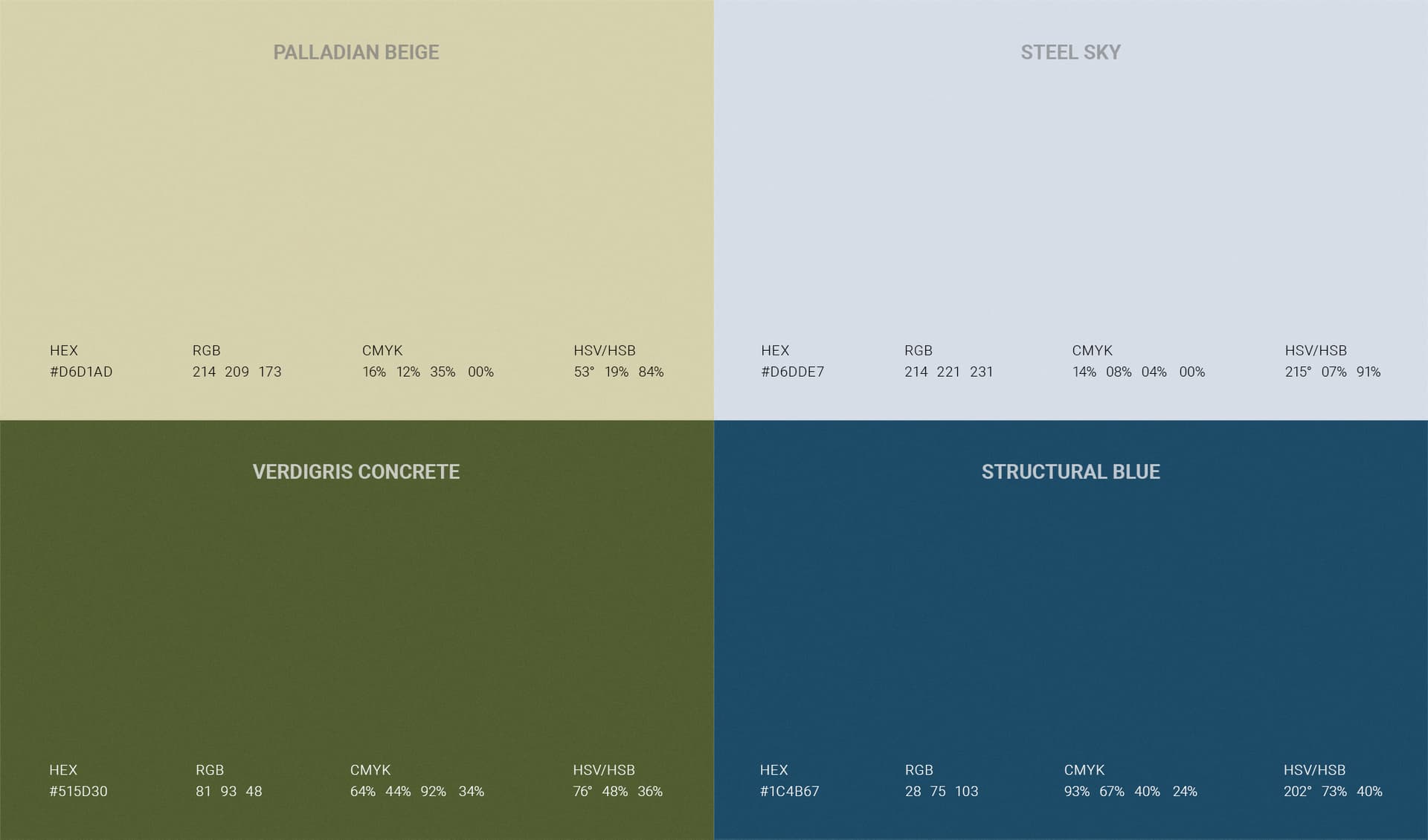
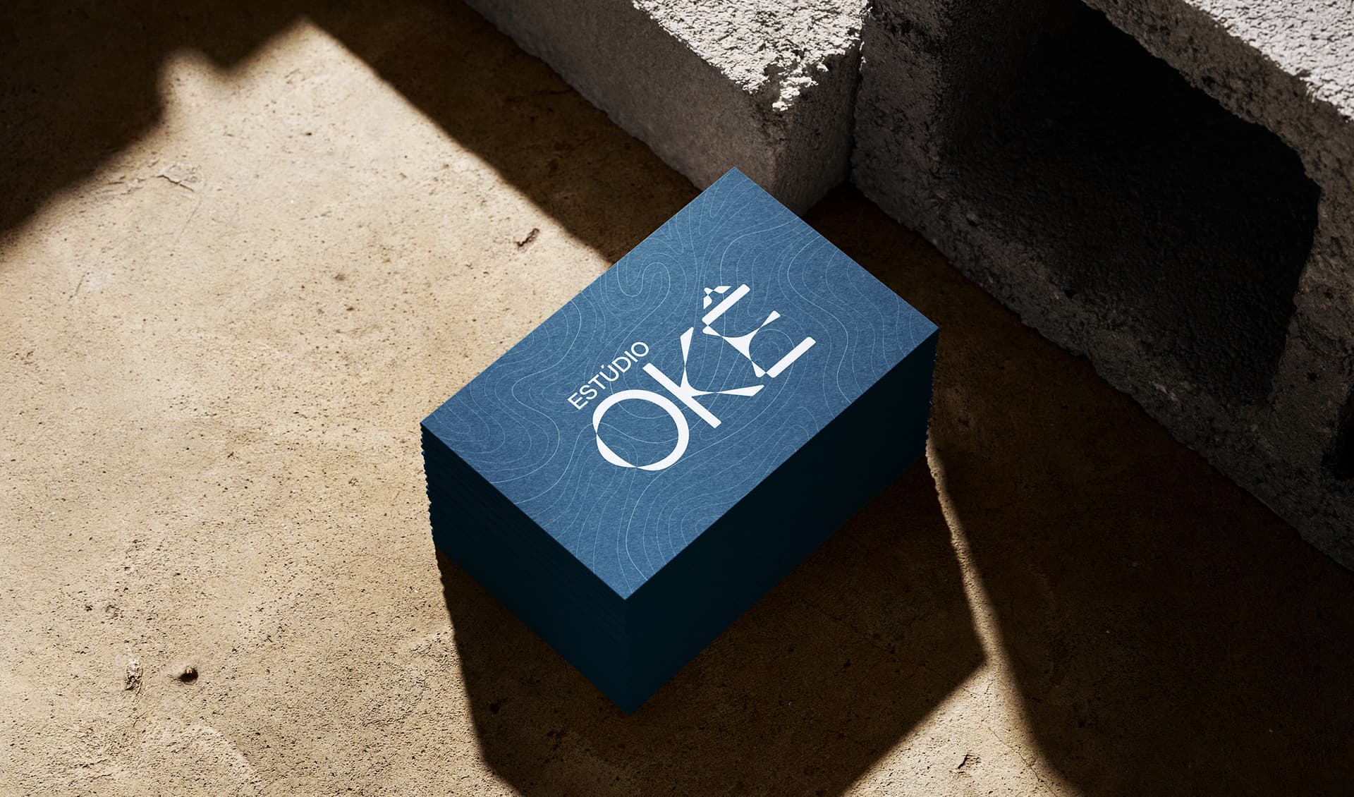
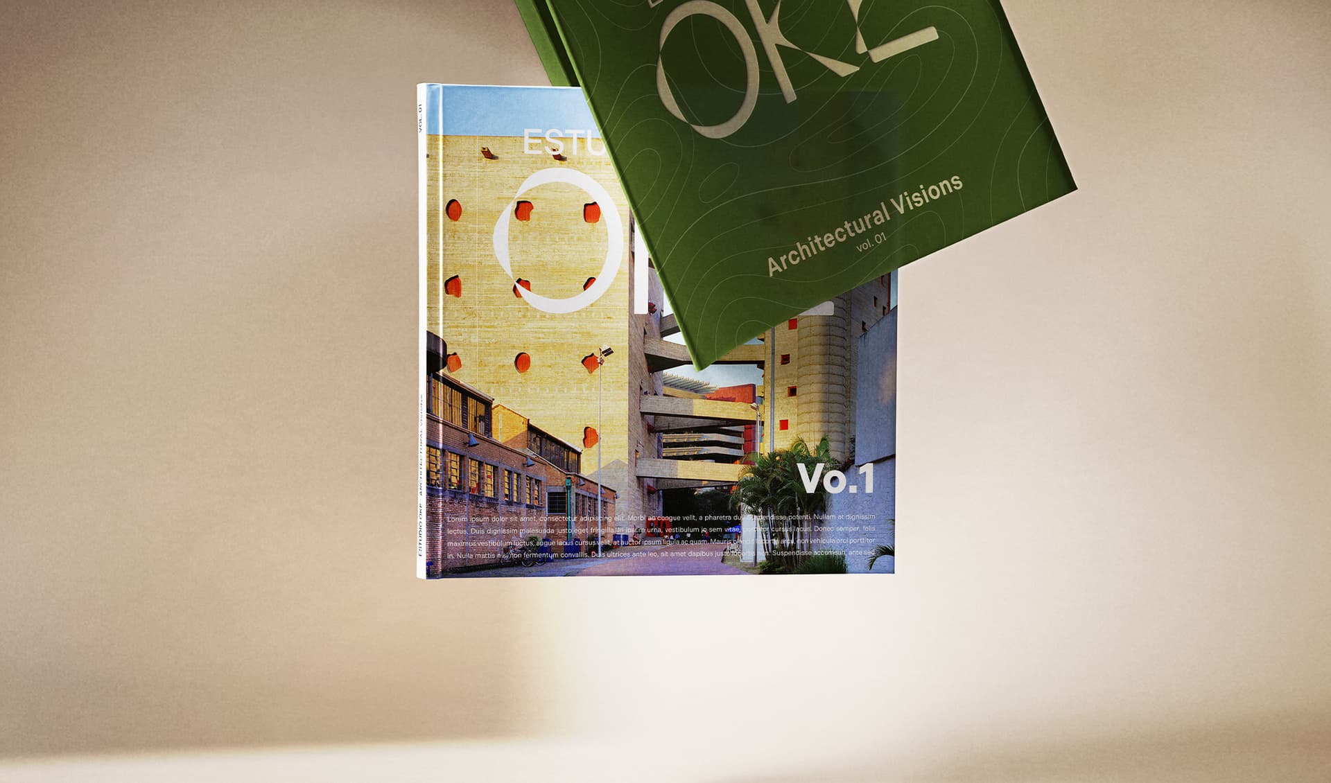
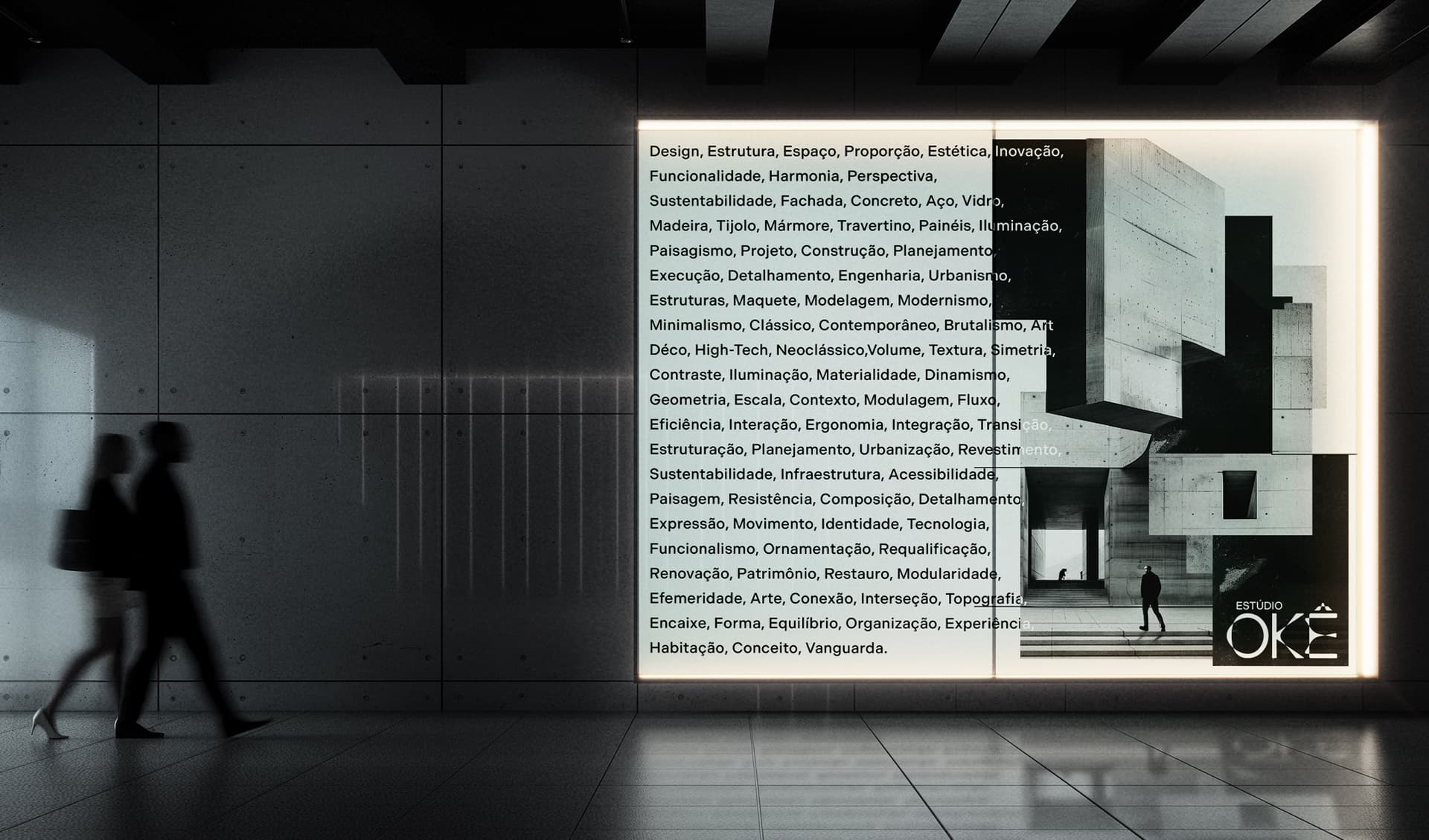
For the visual identity of Estúdio Okê, an architecture and interior design studio located in São Paulo, we developed an exclusive typography inspired by the representation of the Orixá Oxóssi. The letter design symbolically evokes his bow (K) and arrow (E), united with the movement of the world (O), translating the essence of the name Okê, a greeting associated with the Orixá. Oxóssi represents the connection with nature, the skill in hunting, and the relentless pursuit of knowledge, bringing positive energy and protection to the Ilê (home). The visual identity combines the principles of eco-architecture with the aesthetics of contemporary architecture. The eco-architectural approach reflects the union between architecture and sustainability, while contemporary architecture is characterized by its organic forms and nonlinear structures. The selected colors — light green, dark green, light blue, and dark blue — represent the harmony between nature and modernity. The green tones evoke the vitality of the forests and the connection with the environment, while the blue tones refer to the depth, balance, and fluidity of contemporary design. Thus, the visual identity of Estúdio Okê reflects its principles of harmony between innovation, sustainability, and a contemporary approach to design.