Brand Concept
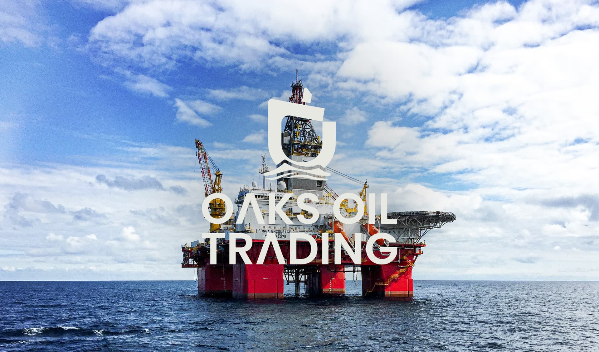
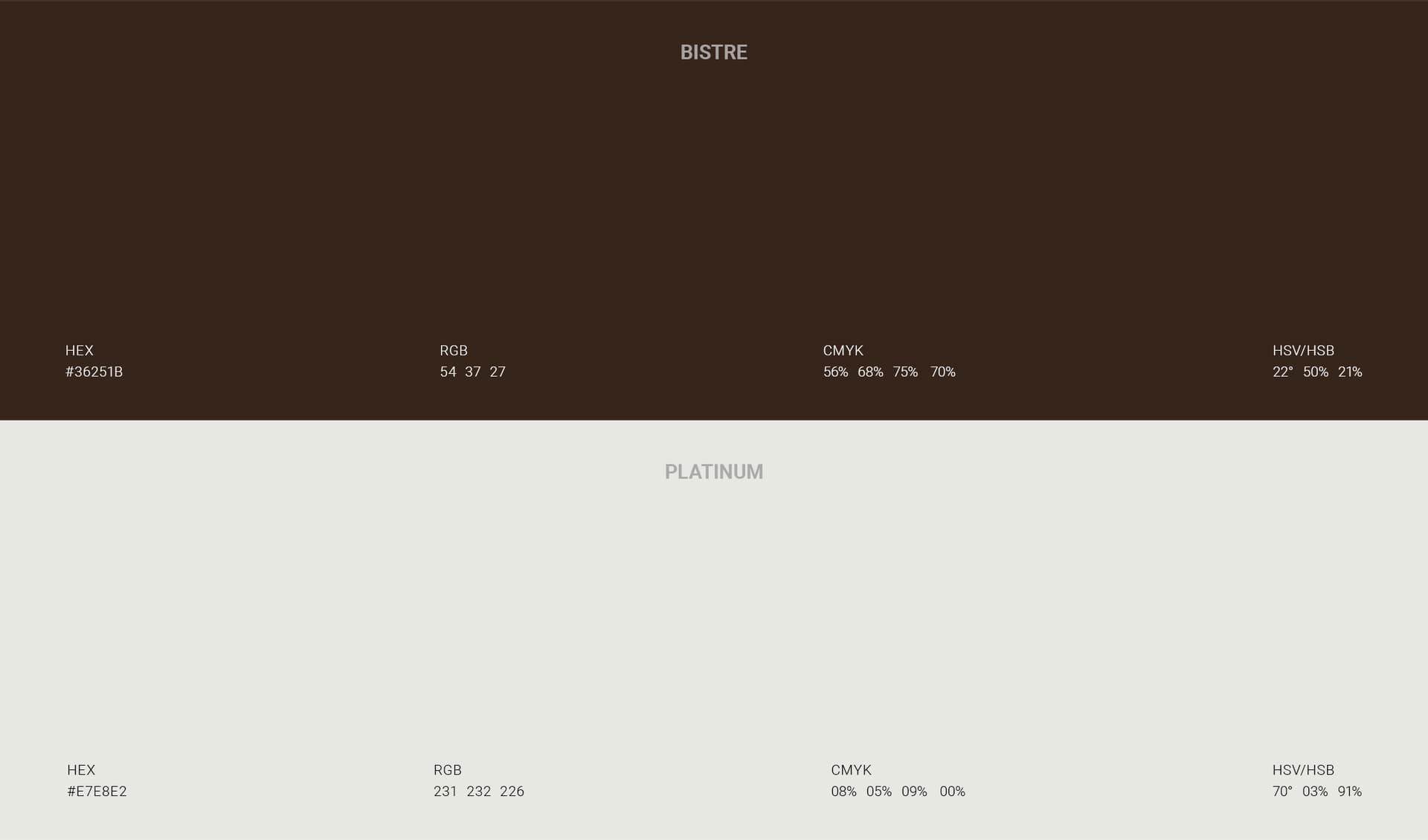
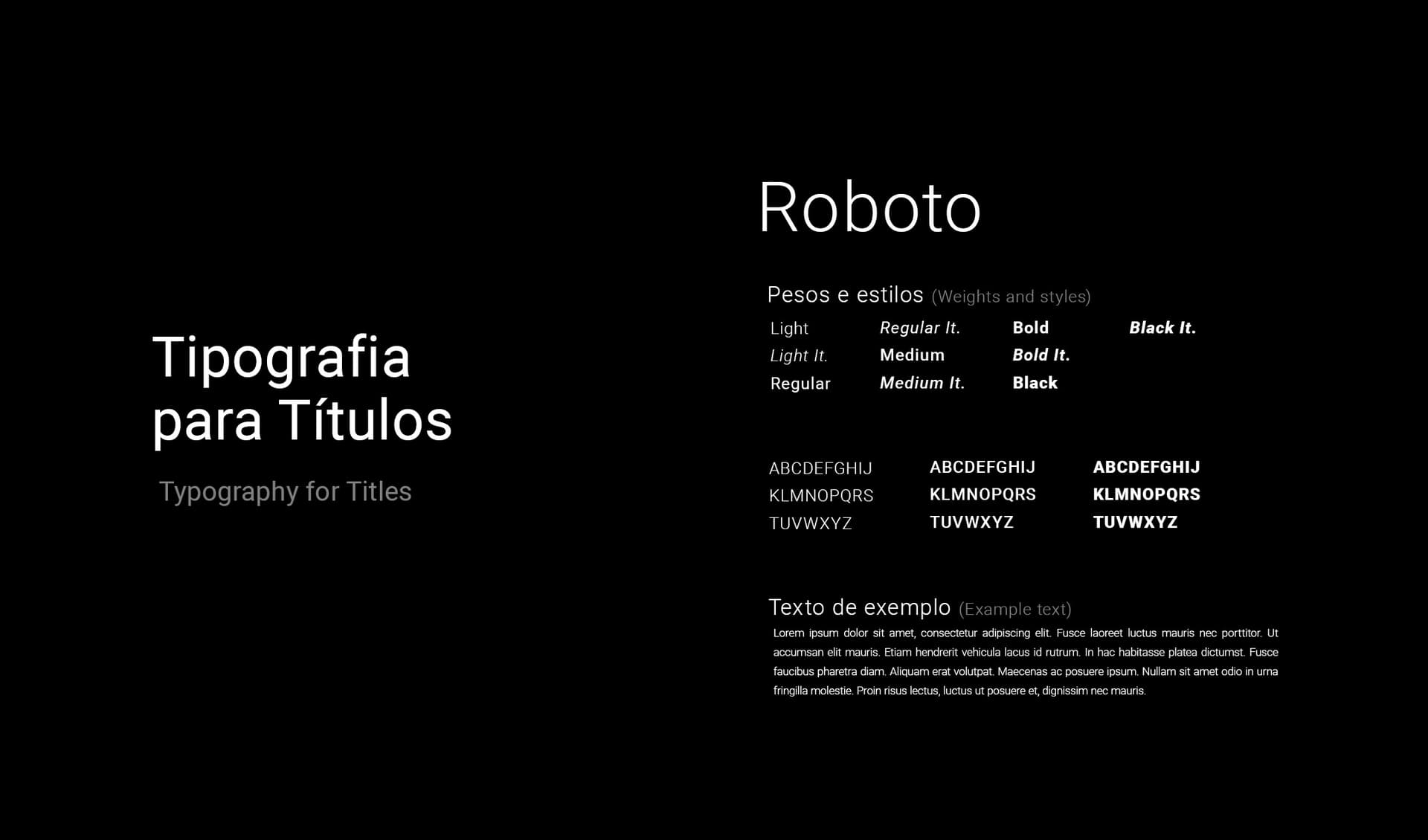
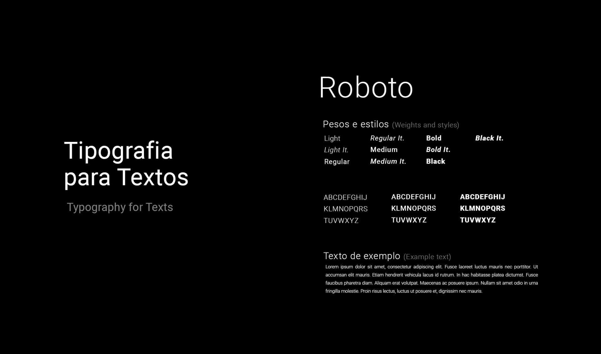
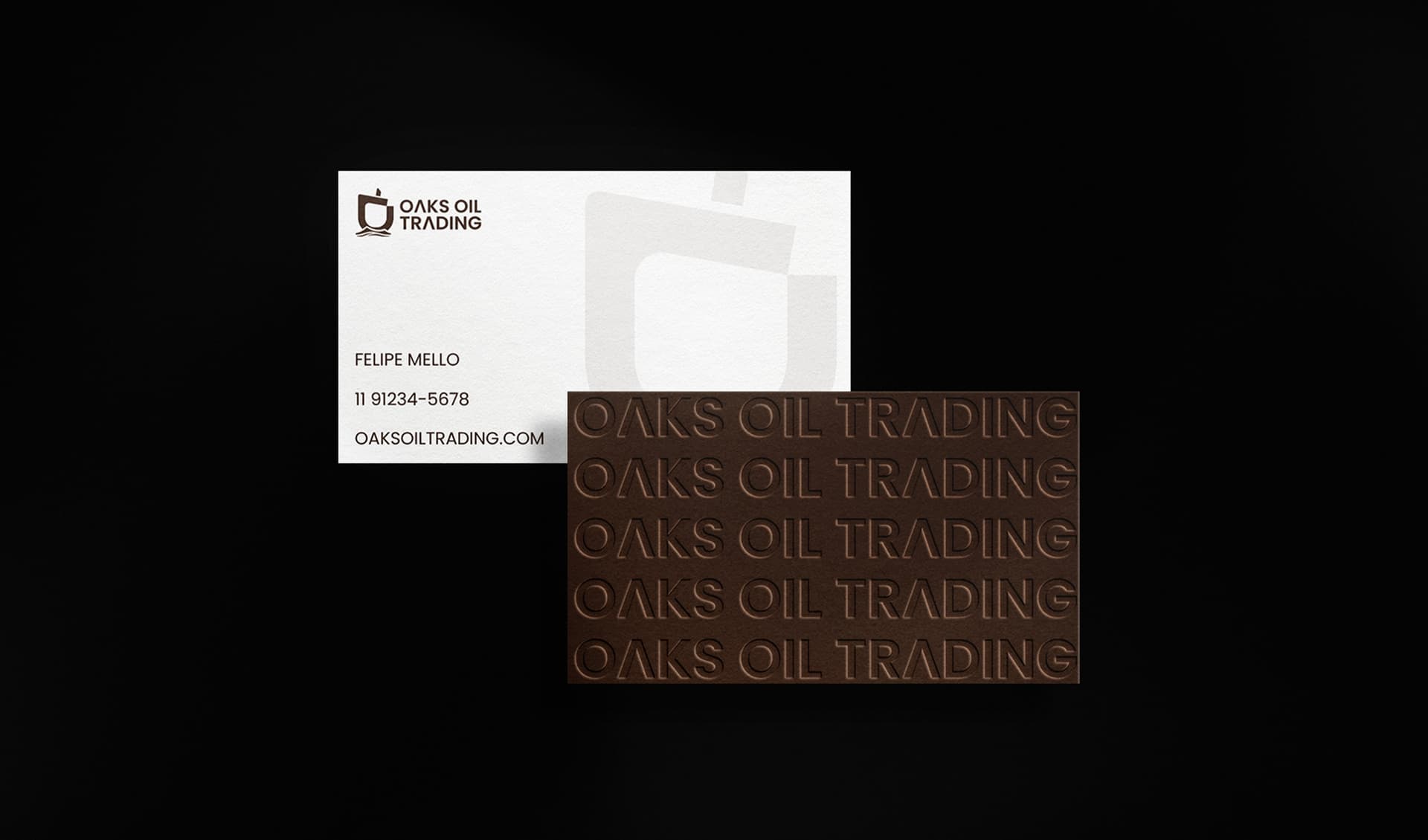
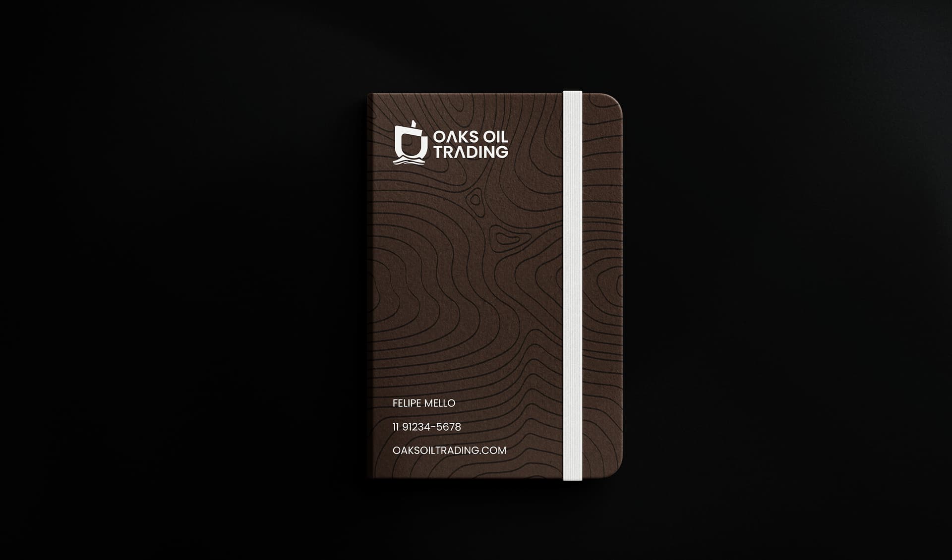
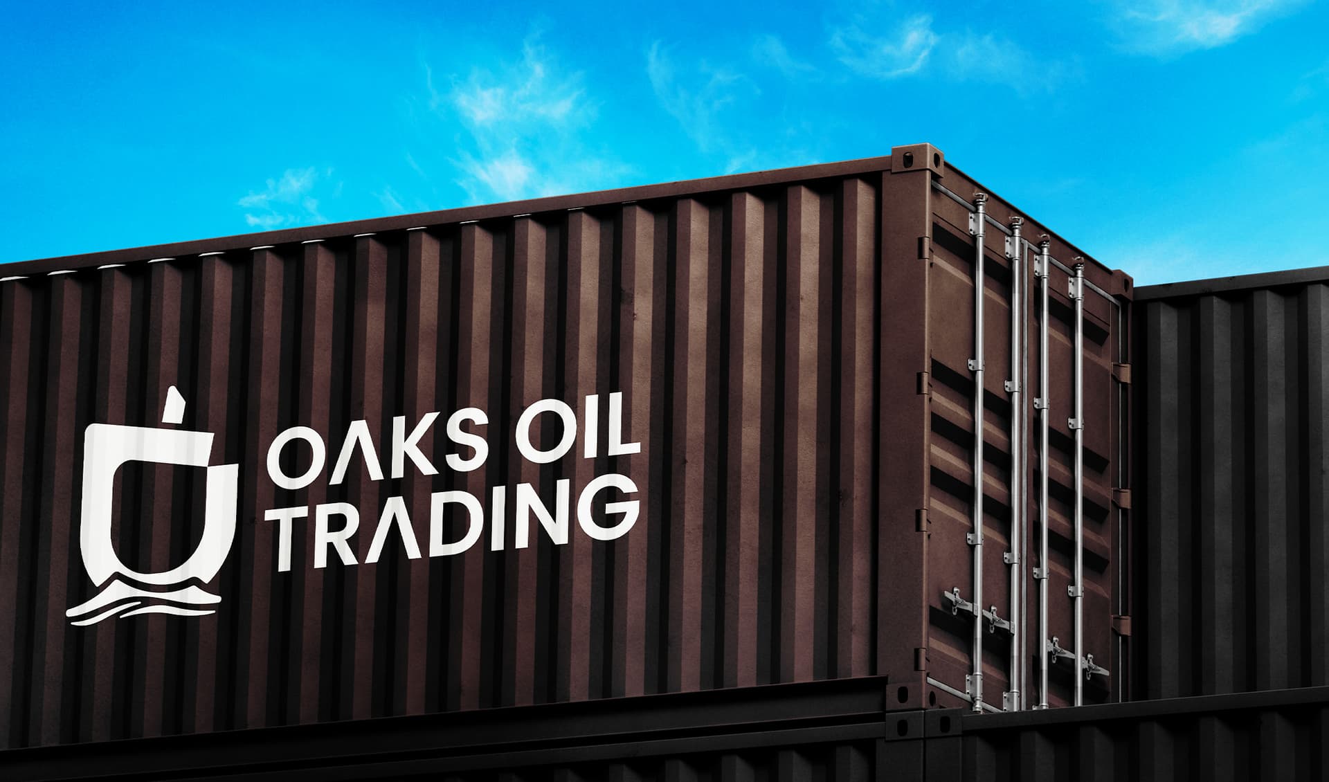
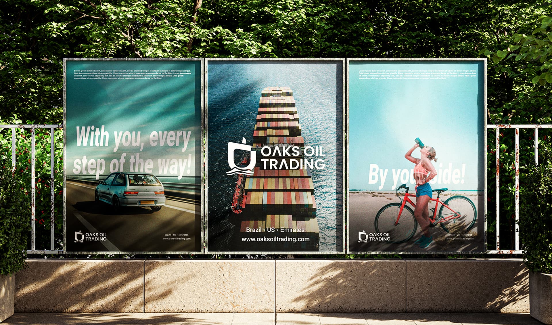
For the development of Oaks Oil Trading's visual identity, a company specialized in the trading of petroleum paper and energy futures, we designed a visual ecosystem that balances institutional solidity with the high-velocity dynamism of global trade. The brand is anchored by a robust, custom-tailored typography, featuring subtle adaptations that project mathematical precision and risk management — indispensable traits in the high-stakes commodities market. The central icon stems from a seamless, triple conceptual fusion: the oak nut (acorn), the bow of a cargo ship, and the geometric representation of a shipping route. The acorn historically evokes longevity, resilient growth, and deep roots — a metaphor for capital security and financial endurance. This organic form is harmoniously integrated with the sharp, forward-leaning lines of a vessel's bow and its navigational coordinates, symbolizing global logistics, strategic direction, and the capability to navigate volatile, complex global markets. The editorial photography selected for the project enriches this narrative. The macro shot of the water's surface, reflecting rich, warm tones, subtly references the fluid, dynamic, and highly valuable nature of crude oil and its financial contracts. In contrast, the image of the vessel beneath the vast sky emphasizes the monumental physical scale of the operations and their real-world economic impact. The color palette was curated to reinforce this market authority. Deep blue and industrial gray represent economic power, corporate gravity, and analytical rigor. To deliver visual balance and a contemporary edge, stark black and clean white frame the identity, ensuring Oaks Oil Trading communicates with absolute clarity, sophistication, and timeless credibility across all physical and digital touchpoints.