Brand Concept
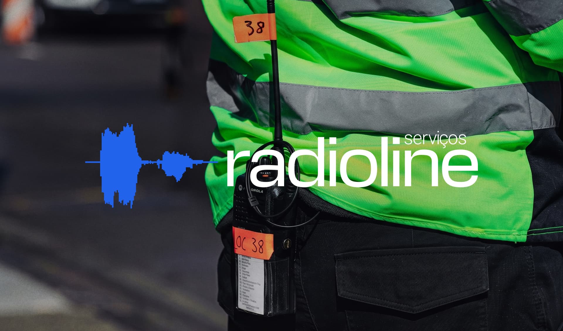
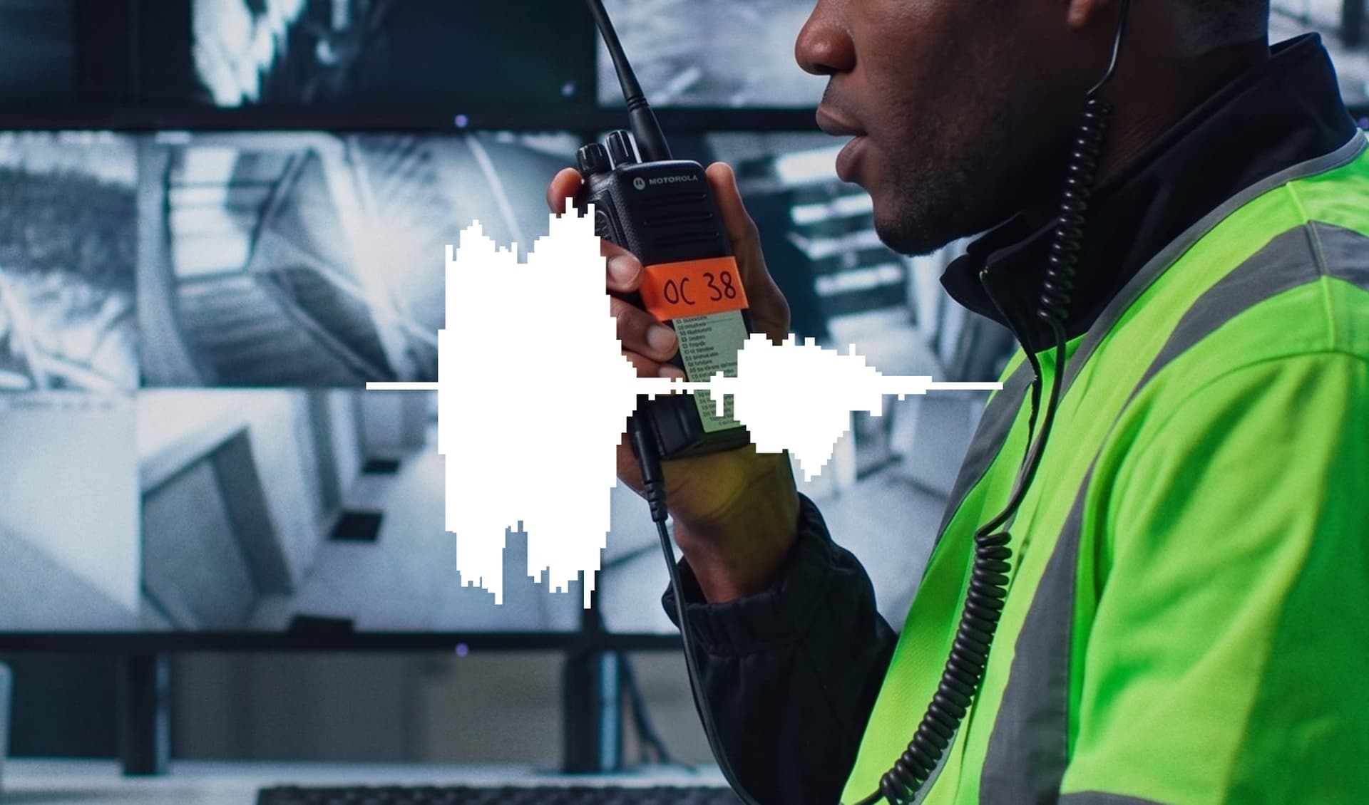
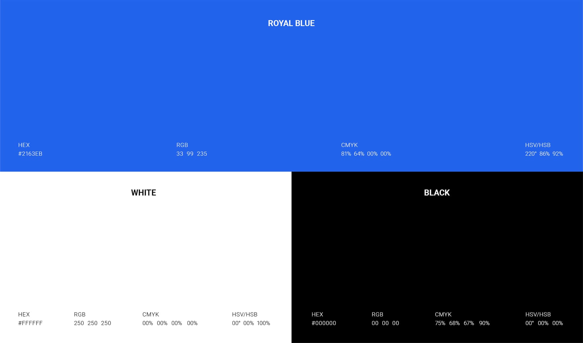
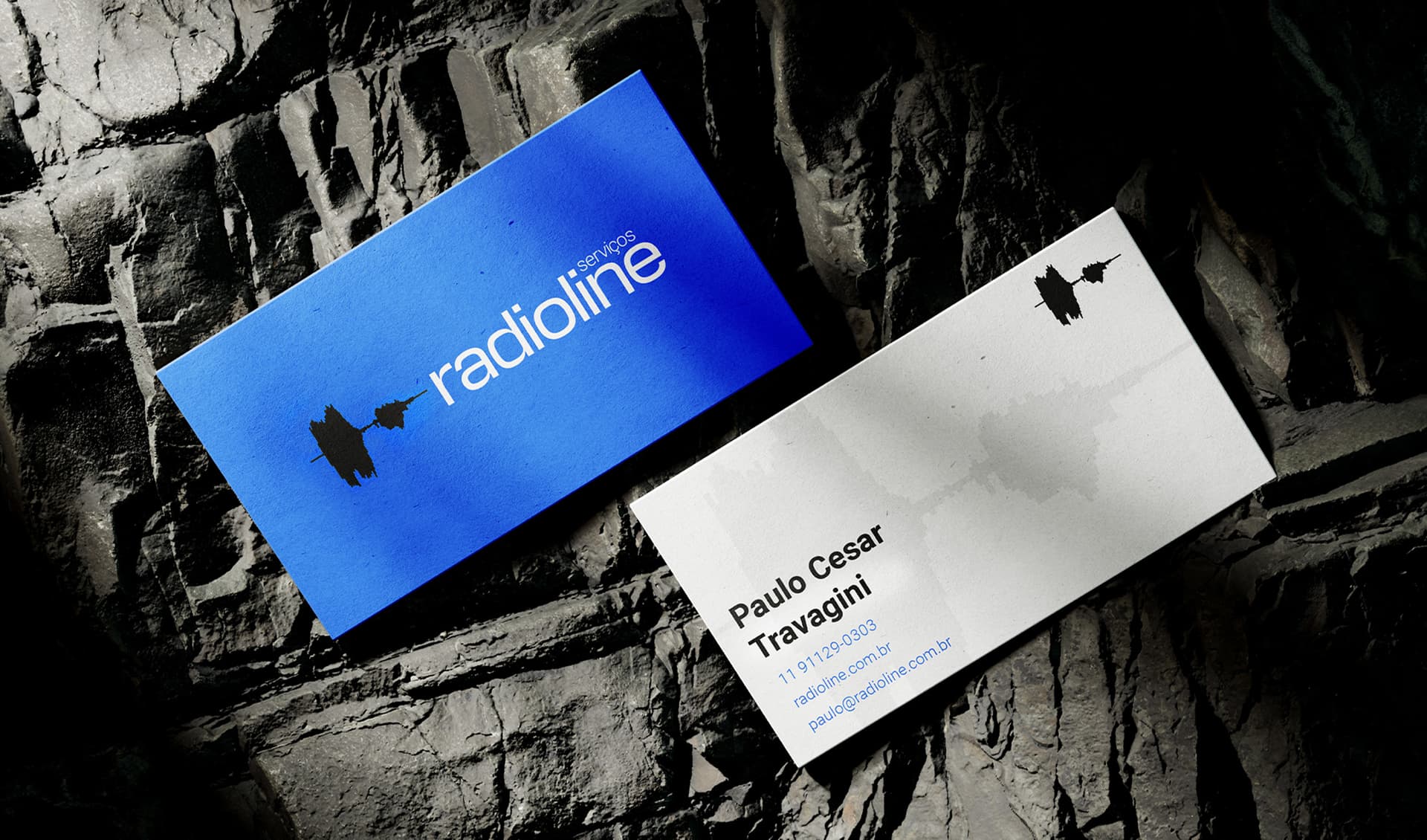
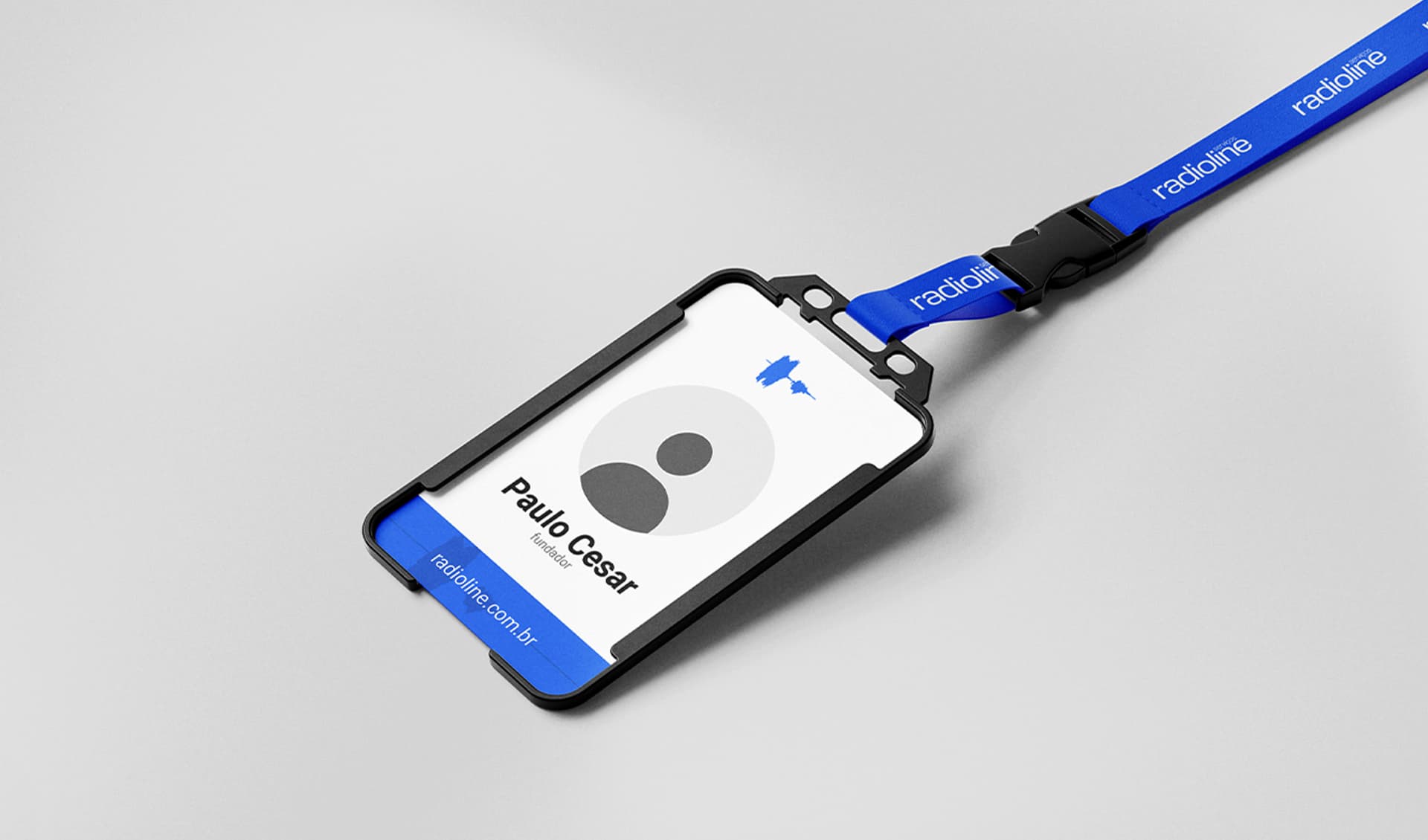
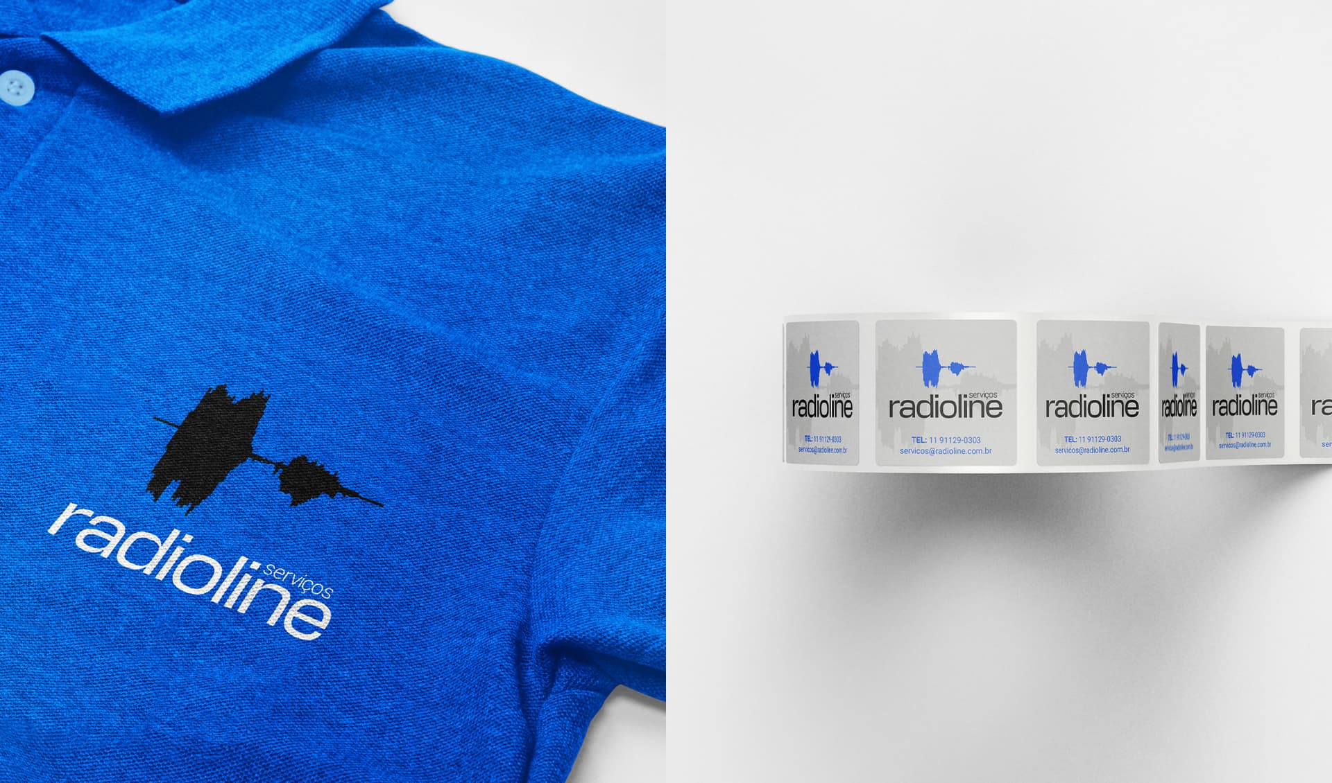
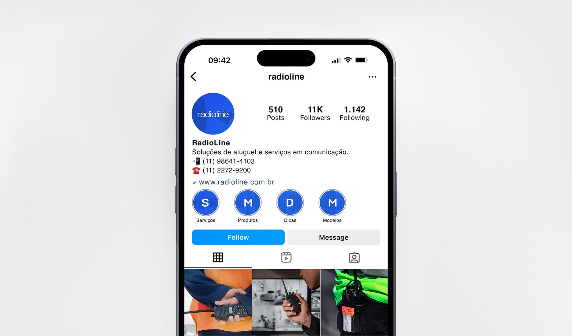
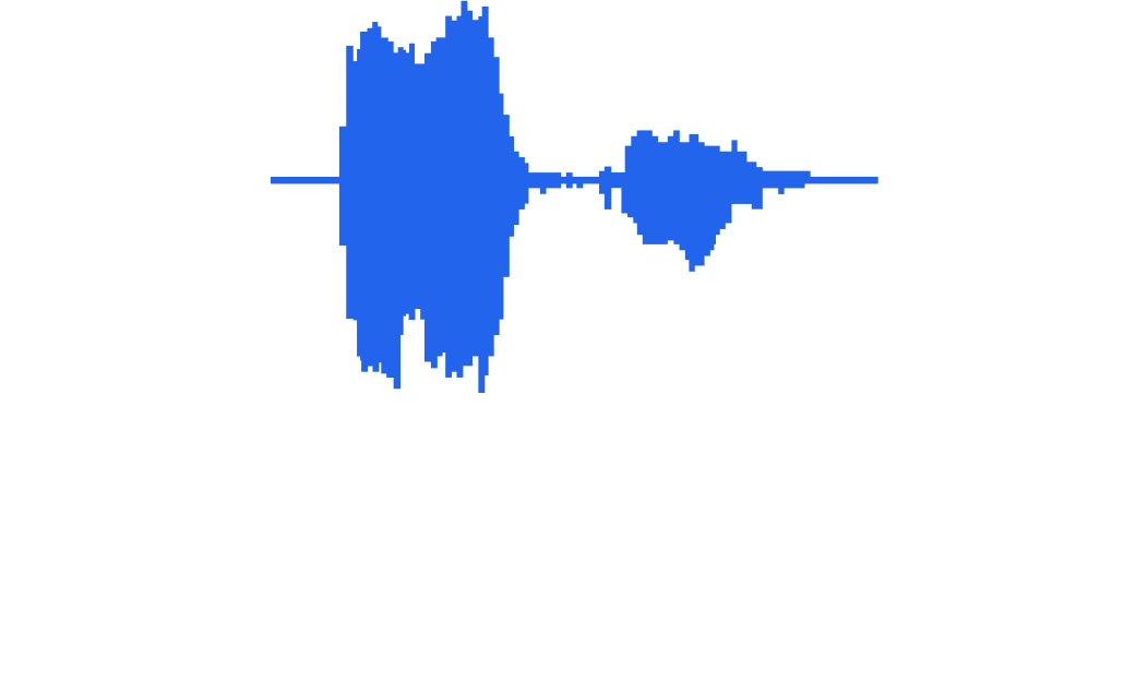
The visual identity for Radio Line Serviços was developed through a graphic and sonic exploration of the waves generated by the articulation of the initials R and L. Through the visualization and analysis of sound frequencies, these organic forms were abstracted and transformed into a unique visual symbol — dynamic, precise, and minimal. The result translates the essence of the brand into a distinctive graphic language, establishing a solid, clear, and recognizable presence. The visual direction combines clean forms with a contemporary language to reinforce Radio Line's core attributes: trust, clarity, and presence. Royal blue serves as the primary color, conveying security, stability, and credibility, while black and white provide a neutral and timeless foundation, enhancing contrast and giving the visual system greater versatility. Applied consistently across institutional materials, communications, and identification elements, Radio Line Serviços' visual identity builds a professional and memorable image. The system brings together concept, functionality, and visual strength to position the brand with clarity within the radio and services sector, projecting a sense of solidity, technology, and trust.