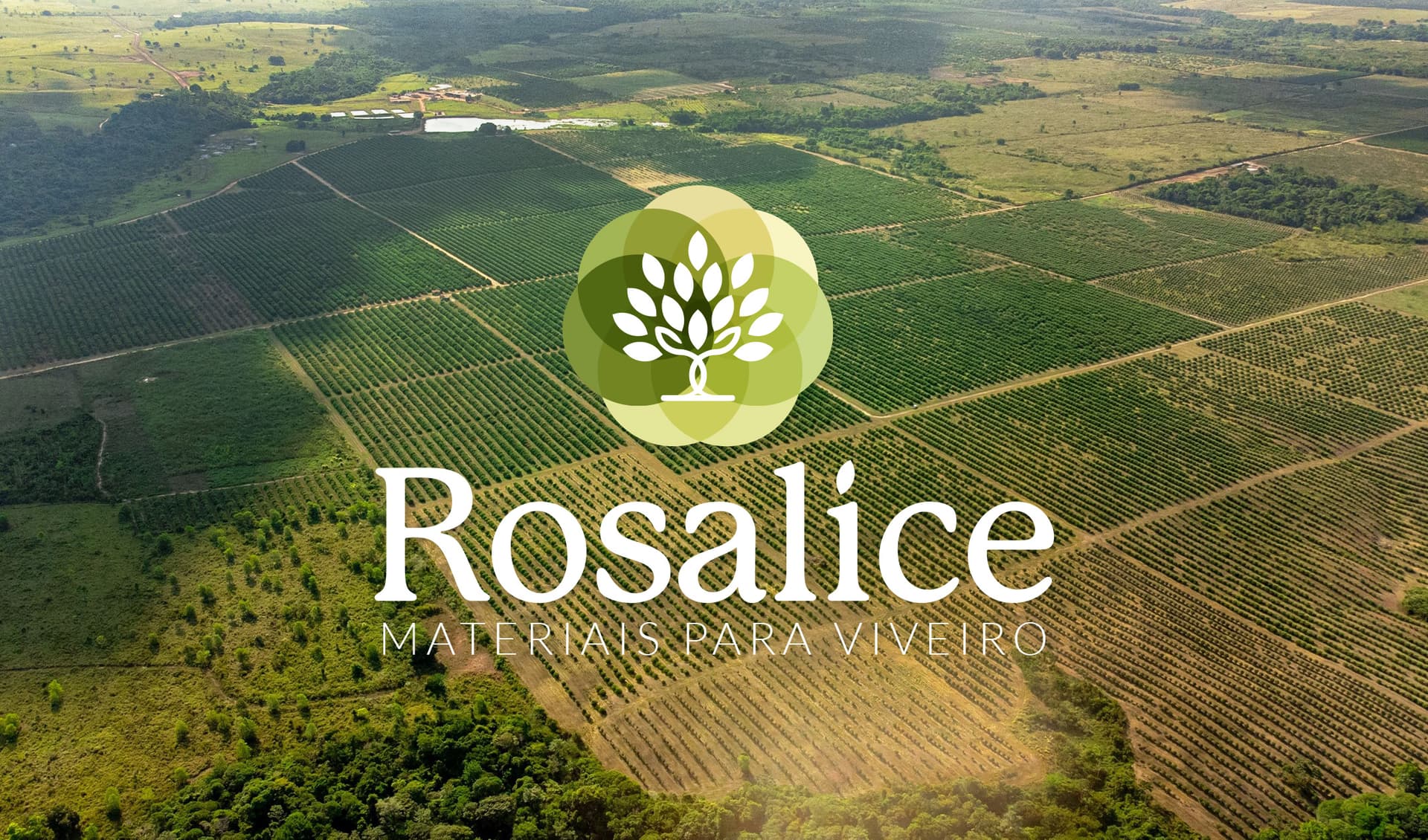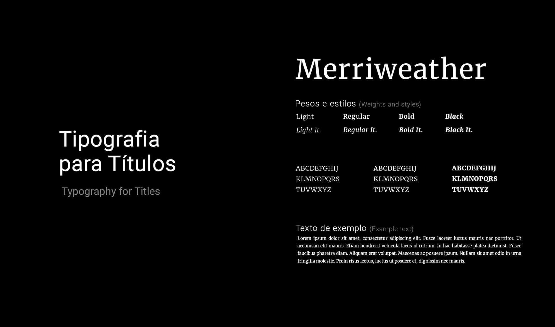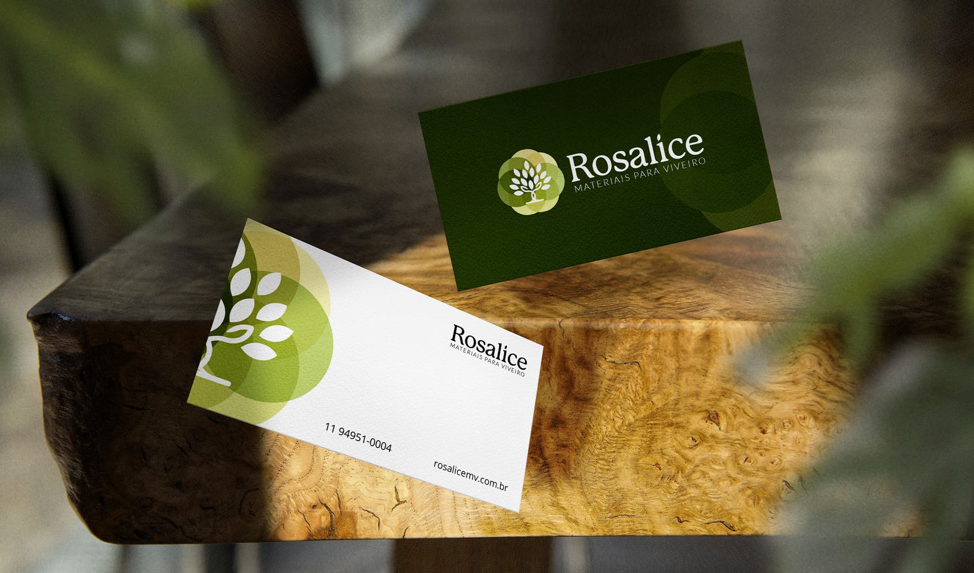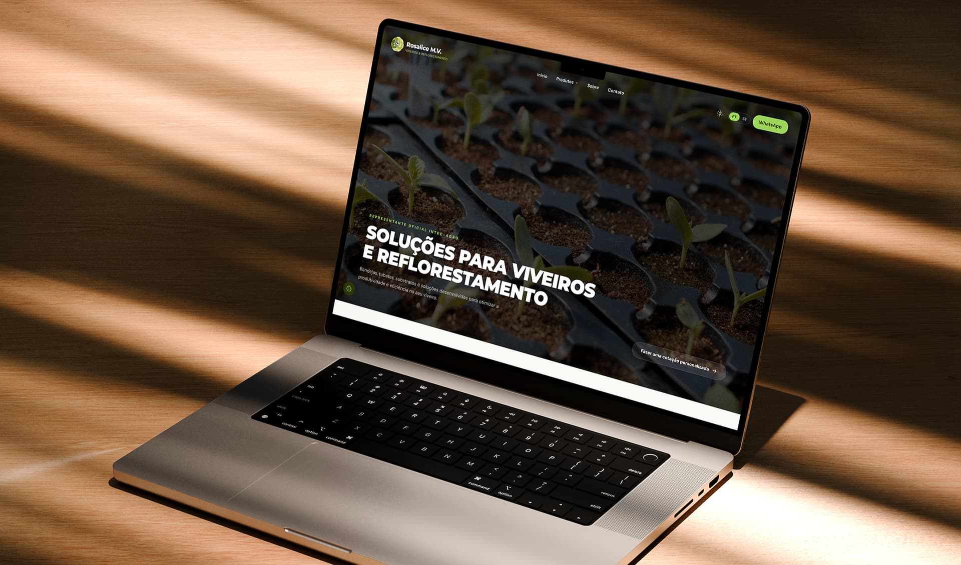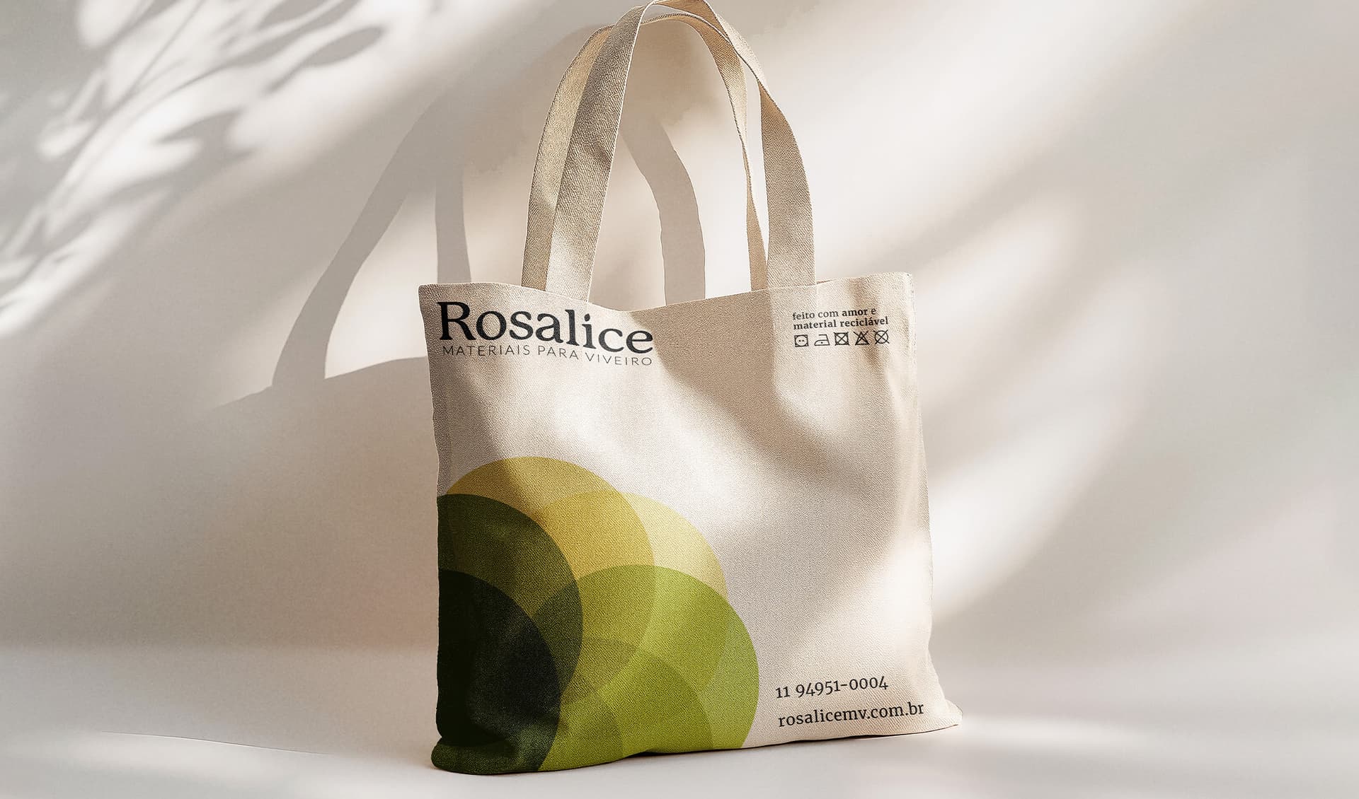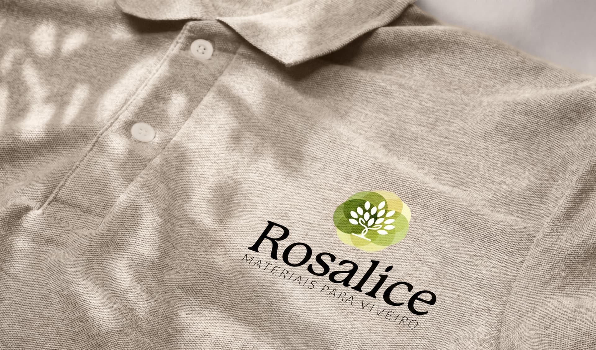
The visual identity for Rosalice was developed around the beginning of the cultivation cycle. Inspired by the Tree of Life, the symbol combines organic growth with the structured geometry of planting fields, creating a visual system where every element naturally converges toward the center of the mark. The layered forms represent cultivation, continuity, and the progression of growth, reflecting Rosalice's role in supporting nurseries and reforestation projects from the very first stage. This balance between natural and geometric elements creates a contemporary identity rooted in precision, reliability, and long-term development. To complete the visual language, a custom logotype was designed exclusively for the brand. Details such as the seed-inspired dot on the “i” and the tree-like construction of the “l” reinforce the concept without compromising clarity. Applied consistently across every touchpoint, the identity establishes a timeless and recognizable presence that reflects the company's expertise and commitment to quality.