Brand Concept
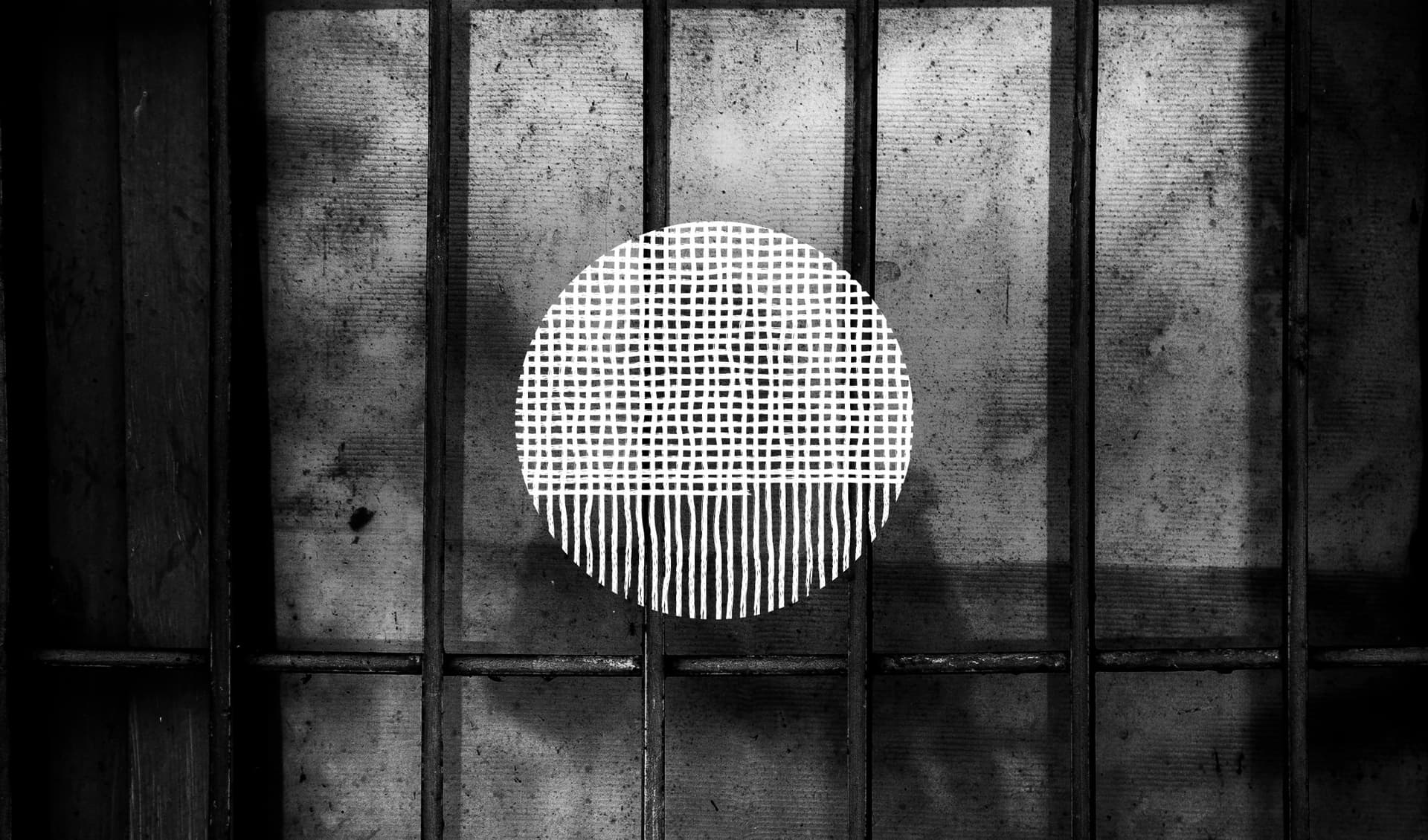
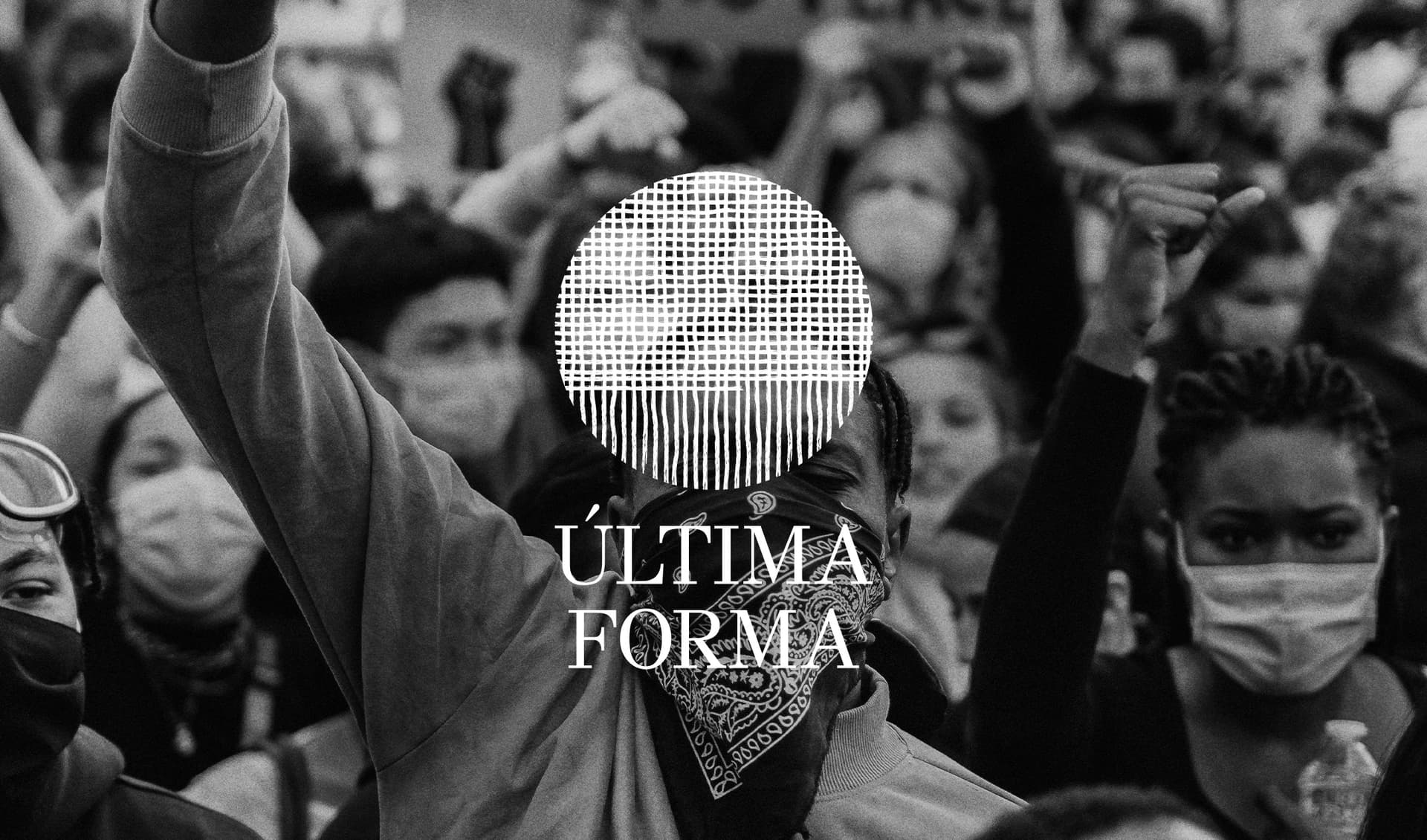
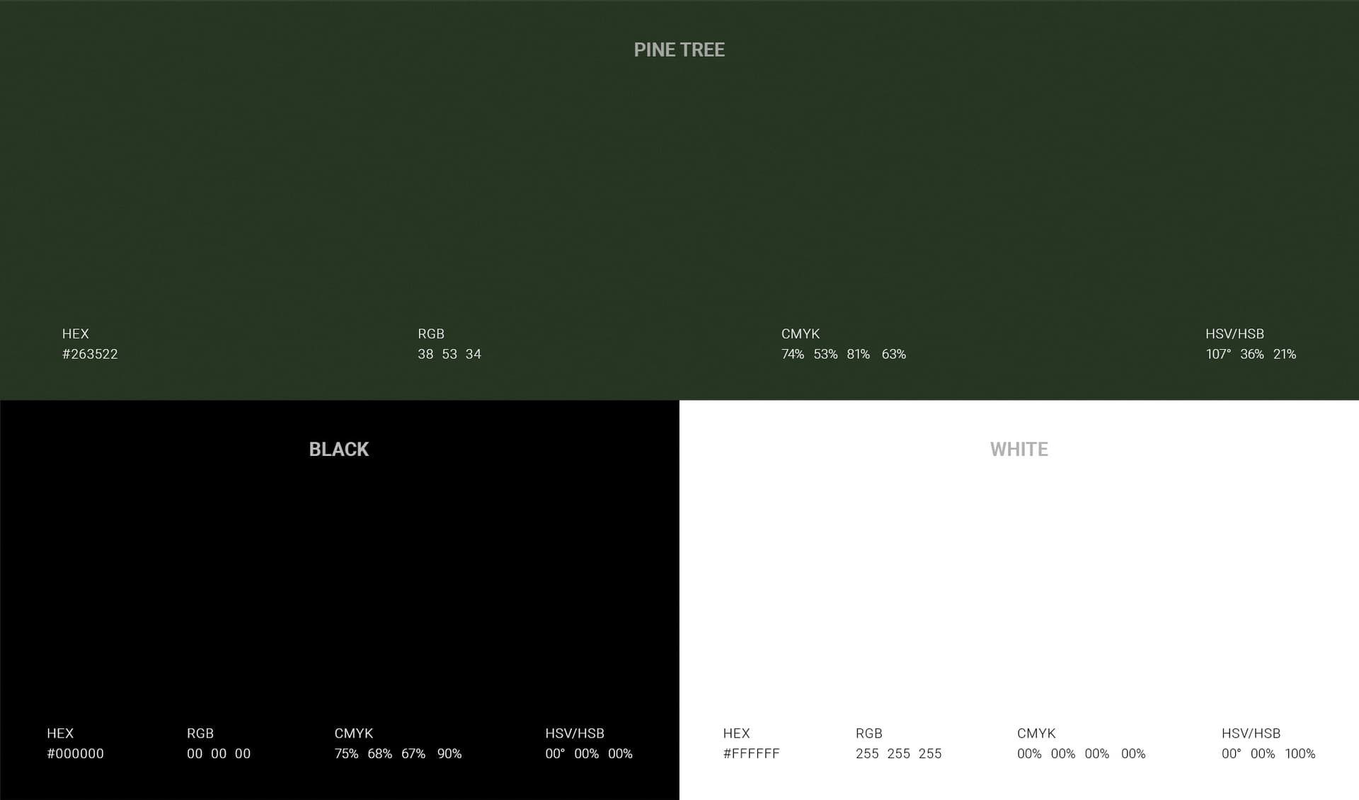
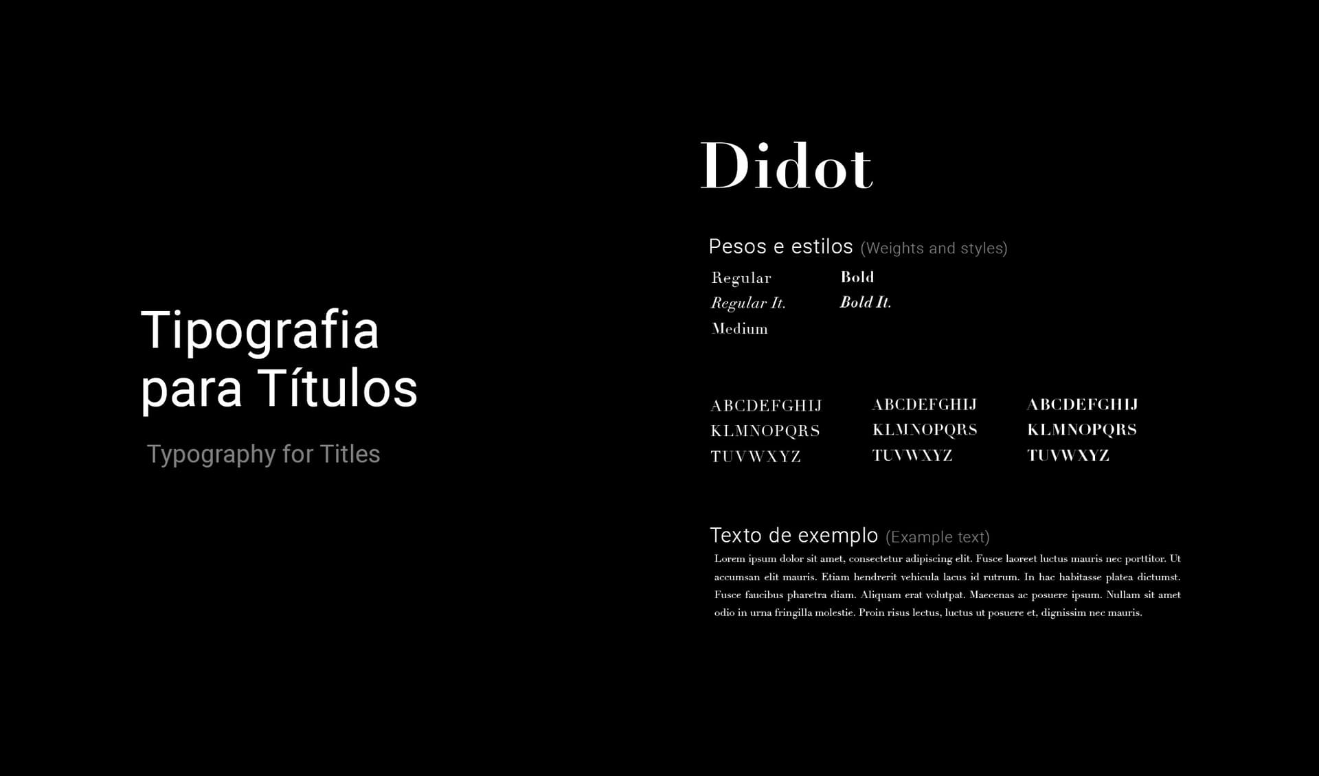
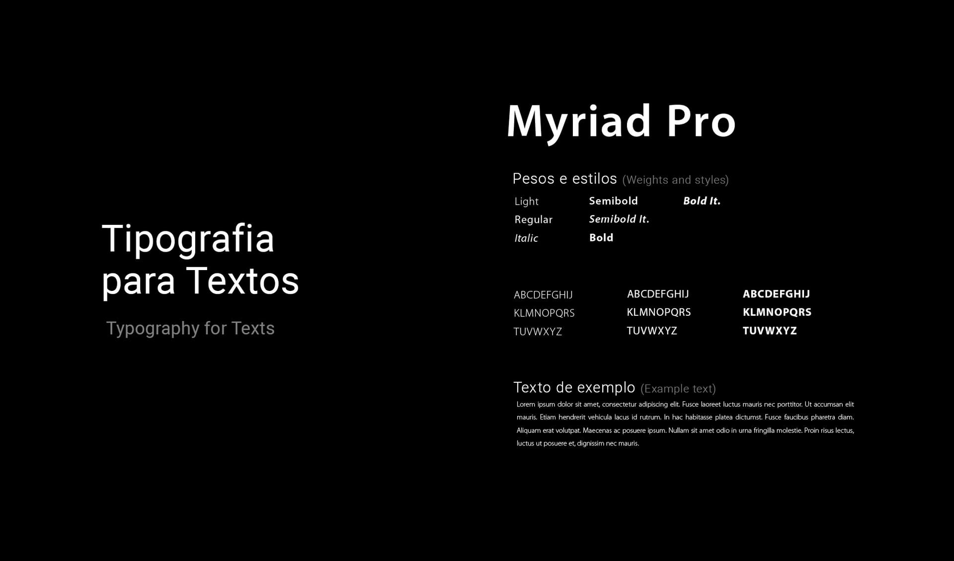
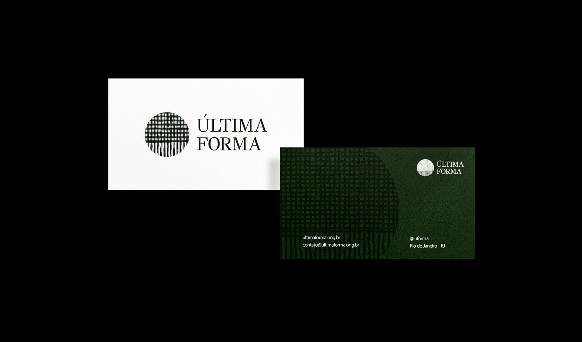
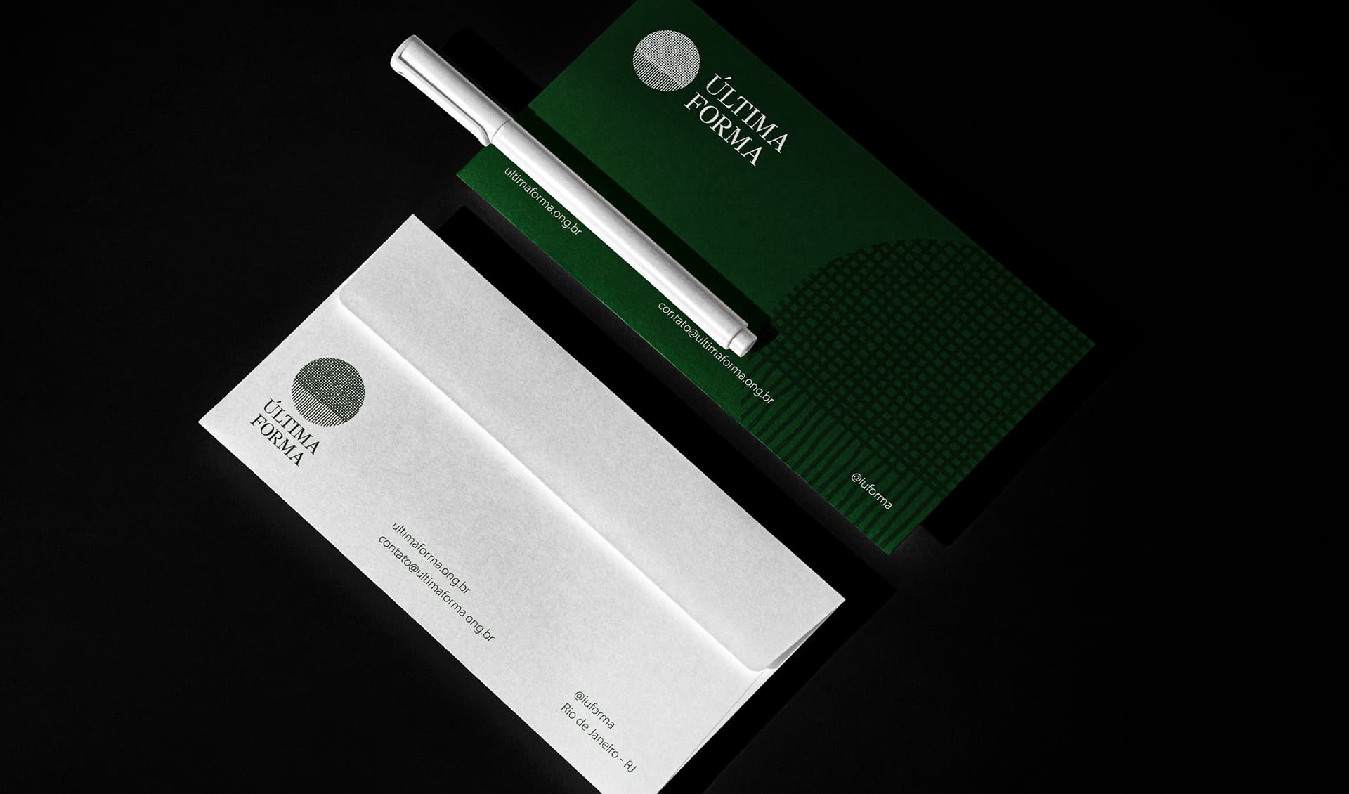
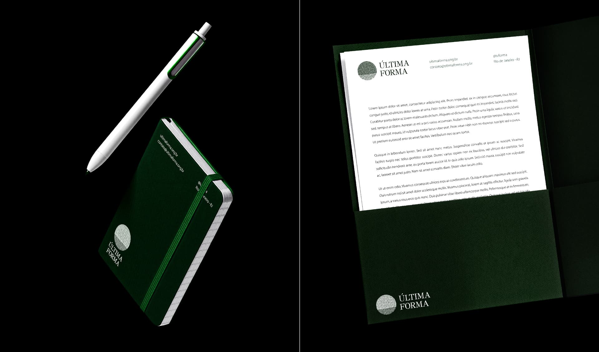
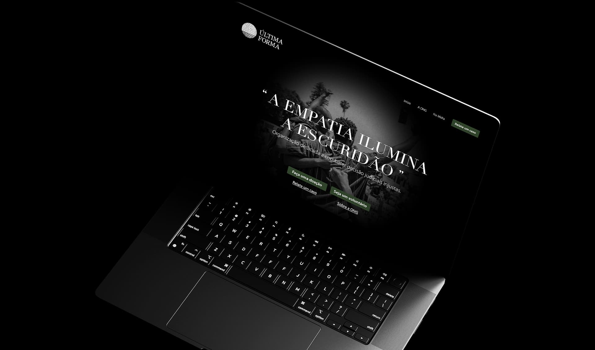
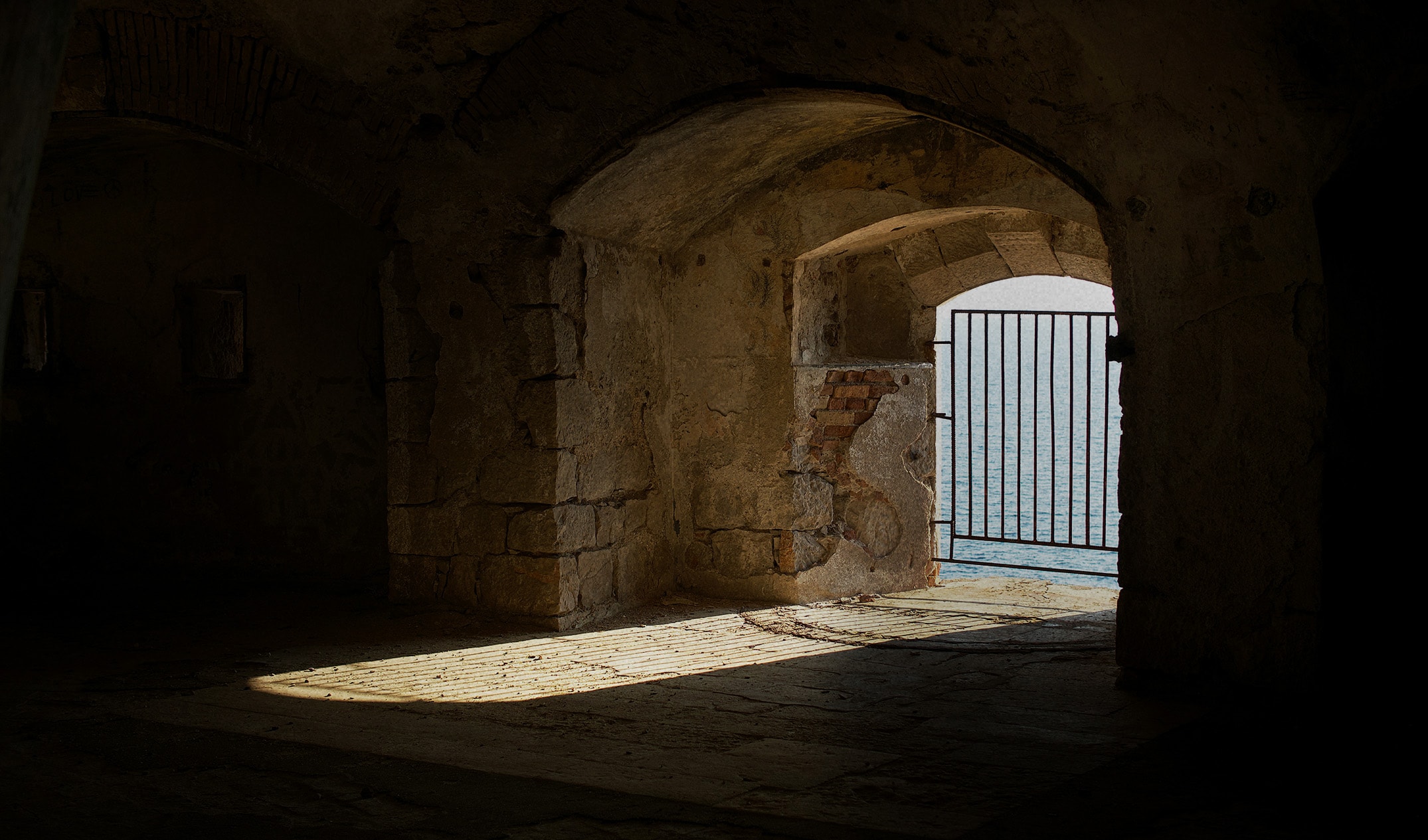
For the creation of Última Forma's visual identity, we developed a brand ecosystem that embodies the true essence of resilience, unity, and transformation. The primary icon is deeply inspired by the organic lines naturally formed in a woven fabric. Individually, a single thread lacks structure, but when interwoven into a fabric, it gains definitive shape, contour, and formidable solidity. This serves as a powerful visual metaphor for those who, when provided with critical legal and human support, find a new path to justice and societal reintegration. The campaign's art direction harnesses imagery with intense emotional gravity to echo the brand's core message: "Empathy shines a light in the darkness.". Gritty photographs of prison bars and dark institutional confinement are sharply contrasted with scenes of collective protests and raised fists, reinforcing the relentless fight for human rights and the restoration of a silenced voice. The selection of the classic, serif Didot typography for titles grounds the brand in seriousness, legal rigor, and necessary institutional authority, while Myriad Pro ensures absolute clarity and modern accessibility in the body text. The curated color palette carries profound and contrasting meanings. Stark black and pure white symbolize the definitive contrast between systemic injustice and rightful reparation. Dark green (Pine Tree) acts as the foundational color of the identity, representing structured hope, steady renewal, and unyielding resilience. Beautifully applied across high-end corporate stationery — such as textured folders, notebooks, and business cards — this visual identity perfectly reflects the ultimate mission of Última Forma: to provide unwavering support to those who have been unjustly judged and imprisoned, restoring their fundamental dignity and helping them rewrite their stories.